Design System
One token library, one component set, one shared language built to unify every enterprise product
Design Systems
Enterprise · Foundations
ROLE
Product Designer
Scope
8 weeks
TEAM
2 Enginners, 1 PM, me
Domain
Enterprise · Foundations


The team had no shared design language. I built the infrastructure.
As a growing team, we had no proper design system in place - every screen was a fresh set of decisions on colour, spacing, and components. I made the call to build one from scratch. It is now what keeps visual hierarchy and data alignment consistent across every screen we ship.
Role | UX Designer - End-to-end |
|---|---|
Tools | Figma Variables · Auto Layout |
Timeline | 6–8 months |
Serves | RMS · PeopleAssist AI · SDI + all downstream products |
Coverage | 20+ Components · Foundations · Core Components · Data Viz · Templates |
THE PRODUCT
One library. One token layer.
Every product drawing from the same source.
A growing enterprise software suite serving semiconductor manufacturing teams across desktop, tablet, and mobile. As the product family grew, each new tool was being built from scratch - same components, different decisions, zero shared language. The design system changed that. One foundation now powers everything.
Built in close collaboration with engineers, frontend developers, and product managers across multiple product teams - aligning on token architecture, component naming conventions, and a phased rollout from foundations through to full suite adoption.
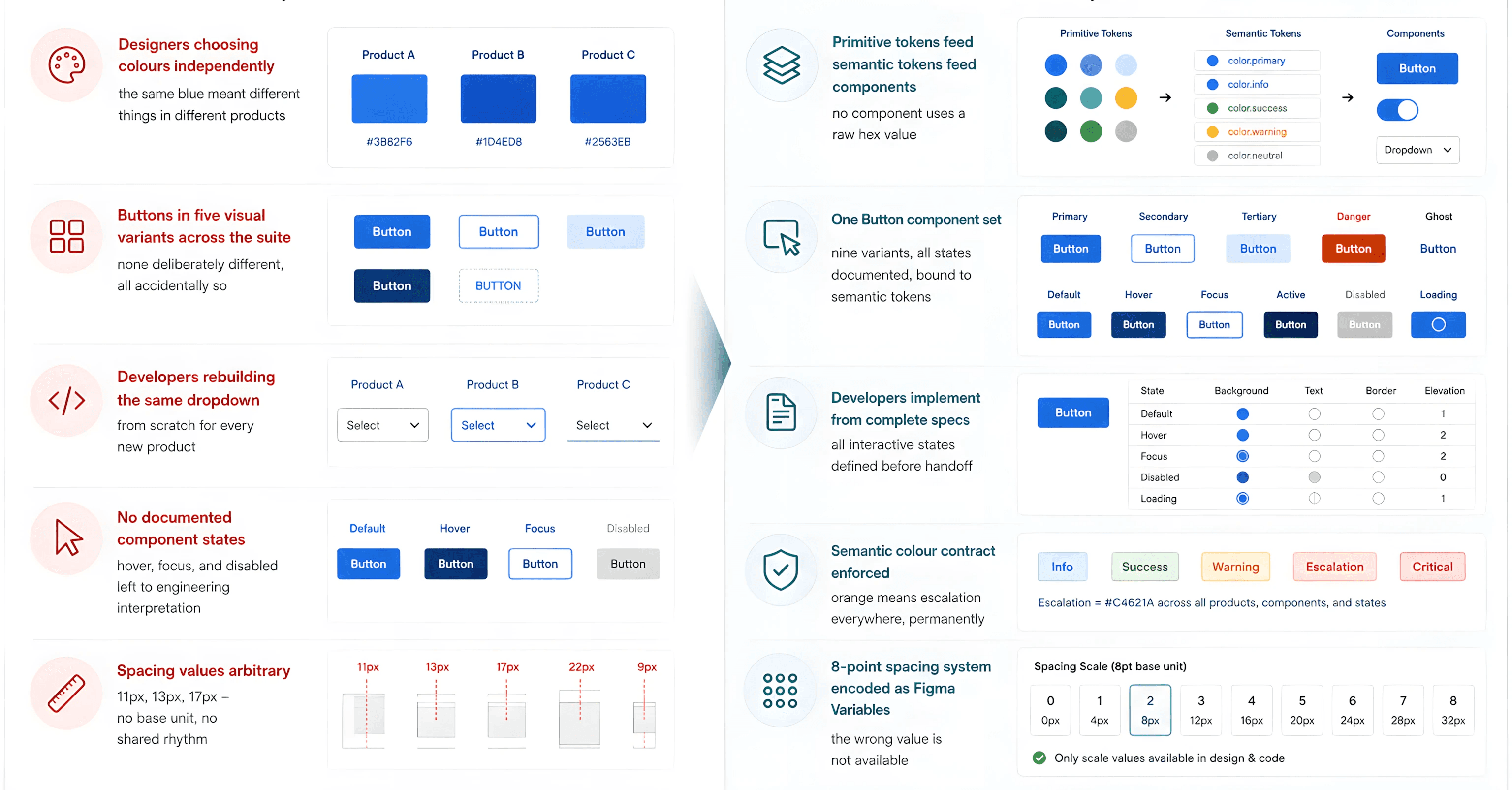
BEFORE VS AFTER
Every Screen a fresh decision to One decision, everywhere.
THE BRIEF
What the team needed.
"We need a shared design system - components should be consistent across products, and engineers should not have to ask what the hover state looks like for every single component they implement."
Right brief. Right problem. But the scope needed to be reframed first.
THE REAL PROBLEM
The missing component was not the problem.
The missing architecture was.
THE REFRAME
"A design system built without a token architecture is just a shared Figma file. A token architecture is what makes a design system structurally enforce consistency - not just recommend it."
The initial request was for a component library. When I started the audit, what I found was deeper - there was no semantic contract for colour, no base unit for spacing, and no naming convention that would make the system usable by engineering without a phone call. Building components on top of that foundation would have solved the visible problem and left the structural one untouched. I reframed the scope in week one: foundations first, components second.
That reframe added three weeks to the timeline. Every decision that followed the three-layer token architecture, the semantic colour contract, the spacing scale was built on that foundation. The components came after the infrastructure was proven, not before.
HOW I LED IT
Every architectural decision was mine to make and defend.
Ran a cross-product UX audit before touching a component. I reviewed every product in the suite - RMS, PeopleAssist AI, SDI - and catalogued every inconsistency by category: colour conflicts, alignment variations, component drift. The audit brief was the foundation for everything that followed.
Designed the three-layer token architecture from scratch. Primitive tokens feeding semantic tokens feeding component tokens. No component references a raw hex value. I architected this before a single component was drawn - and made the case to the engineering team for why foundations had to come first. We aligned on that before any component work began.
Owned documentation as a design deliverable, not a post-handoff task. Every component shipped with variants, states, anatomy, sizing, and token bindings documented before it was published to the shared library. If it was not documented, it was not complete.
Ran secondary research into enterprise design systems - Material Design, Carbon DS (IBM), Goldman Sachs, Salesforce Lightning. I studied how leading systems handle semantic colour roles, component naming conventions, and the primitive-to-semantic token relationship before making any architecture decisions.
Presented the system architecture to engineering leads and PM stakeholders - not just the visual output. We got sign-off at the first review because the rationale for every architectural decision was traceable to a specific audit finding or industry precedent.
The design system is now the shared foundation for every product in the portfolio. The team adopted it across the full suite - RMS, PeopleAssist AI, SDI, and all downstream enterprise tools draw from the same token layer. A colour change at the primitive level propagates everywhere automatically. Consistency is structural - not enforced manually each sprint.

THREE DECISIONS I MADE
The calls that shaped how the system actually works.
A design system is not a library of components. It is a series of architectural decisions that make inconsistency structurally impossible. Here are the three calls I made and what I pushed back against to make them.
DECISION 01
Token architecture before any component work
"There was pressure to start building components immediately - the token layer felt like overhead. I made the case that building components without a semantic token foundation means retrofitting everything later when the palette changes. We aligned on doing foundations first."
THE CALL I MADE
Three layers, in sequence: Primitive tokens (raw brand hex values) - Semantic tokens (usage-role values: color/status/error, color/action/primary) - Component tokens (what the button's background references). We didn't move to components until the first two layers were locked and validated against WCAG contrast ratios.
DECISION 02
Semantic colour contract - not just a palette
"The initial ask was a colour palette with hex codes. That solves the visual consistency problem and leaves the semantic problem untouched. The same red was being used for errors in one product and data series colours in another."
THE CALL I MADE
Every colour carries a semantic contract, not just a hex value. Orange means escalation or action required - everywhere, permanently. Green means confirmed or resolved. Red means error or critical failure only - never decorative, never a chart series colour. The meaning is encoded in the token name, not just the colour value.
DECISION 03
A component is only complete when every state is documented
"Developers were spending 2-4 hours per sprint on clarification queries because handoffs specified the default state and nothing else. Hover, focus, disabled, error, loading - all left to engineering interpretation."
THE CALL I MADE
I defined a component completion checklist and we agreed as a team that nothing gets published to the shared library without it: all interactive states documented, all measurements annotated with token bindings, usage guidelines written, and naming convention applied (Button / Primary / Default / Text). We treated incomplete documentation the same as an incomplete component - it does not ship.
CROSS-FUNCTIONAL WORK
The system only works if the whole team works with it.
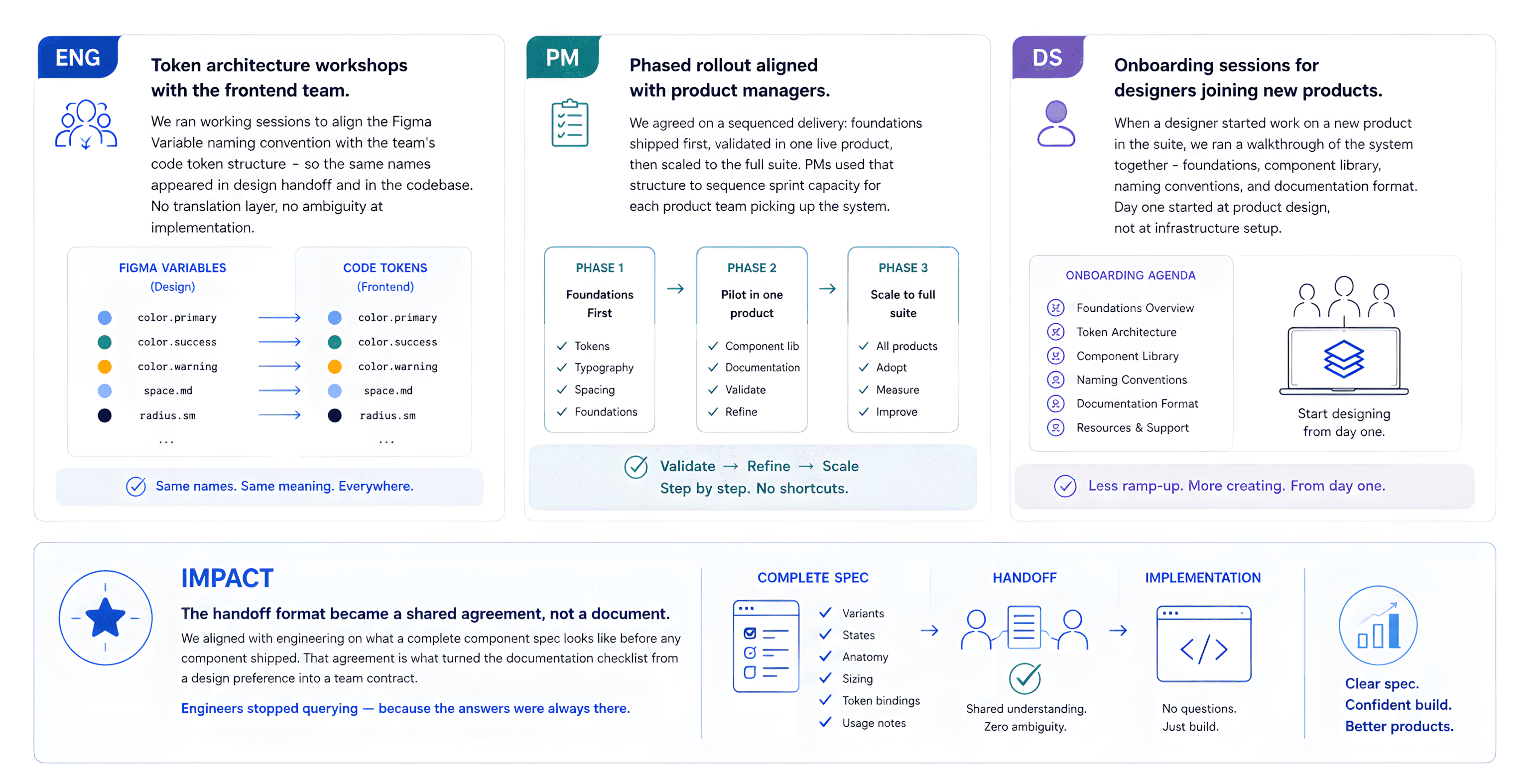
A design system that lives only in Figma is not a design system - it is a design file. Getting this one adopted required working sessions with engineering, alignment with product management, and onboarding every designer who joined a new product in the suite.
ENG
Token architecture workshops with the frontend team. We ran working sessions to align the Figma Variable naming convention with the team's code token structure so the same names appeared in design handoff and in the codebase. No translation layer, no ambiguity at implementation.
PM
Phased rollout aligned with product managers. We agreed on a sequenced delivery: foundations shipped first, validated in one live product, then scaled to the full suite. PMs used that structure to sequence sprint capacity for each product team picking up the system.
DS
Onboarding sessions for designers joining new products. When a designer started work on a new product in the suite, we ran a walkthrough of the system together foundations, component library, naming conventions, and documentation format. Day one started at product design, not at infrastructure setup.
IMPACT
The handoff format became a shared agreement, not a document. We aligned with engineering on what a complete component spec looks like before any component shipped. That agreement is what turned the documentation checklist from a design preference into a team contract. Engineers stopped querying - because the answers were always there.
THE SYSTEM IN USE
Four screens. Four decisions. The same token layer running all of them.
The system's value is only visible in the products it powers. Every screen below draws from the same foundation - the same token layer, the same component library, the same semantic colour contract
SCREEN 01 - COLOUR FOUNDATIONS - FIGMA VARIABLES
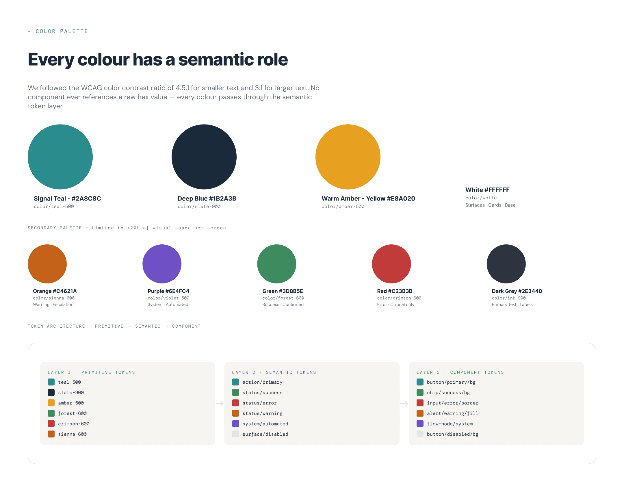
Three layers. No component touches a raw hex value.
The token architecture chain - primitive to semantic to component - is visible here in Figma Variables. Changing the primitive teal value propagates automatically to every component that references color/action/primary. No manual update across 5 products.
THE DESIGN DECISION
I made the call to build the primitive-to-semantic layer before any component work began. Every semantic token carries a usage contract, not just a colour value. Color/status/error means critical failure it is the only place red appears in any product in the suite.
SCREEN 02 - BUTTON COMPONENT SET - 9 VARIANTS

Primary. Secondary. Tertiary. Default. Hover. Disabled. All in one component.
The Button component set is the most-used component in the library. It ships with nine variants across three types and three interactive states. Every fill, stroke, and text colour references a semantic token not a hex value.
THE DESIGN DECISION
There was pressure to start with just the primary button and iterate. I made the case that a component without all states is a partial spec it creates the same ambiguity as no spec at all. We agreed as a team that all nine variants ship together or none ship at all.
SCREEN 03 - STATUS CHIP - SEMANTIC VARIANTS ACROSS PRODUCTS
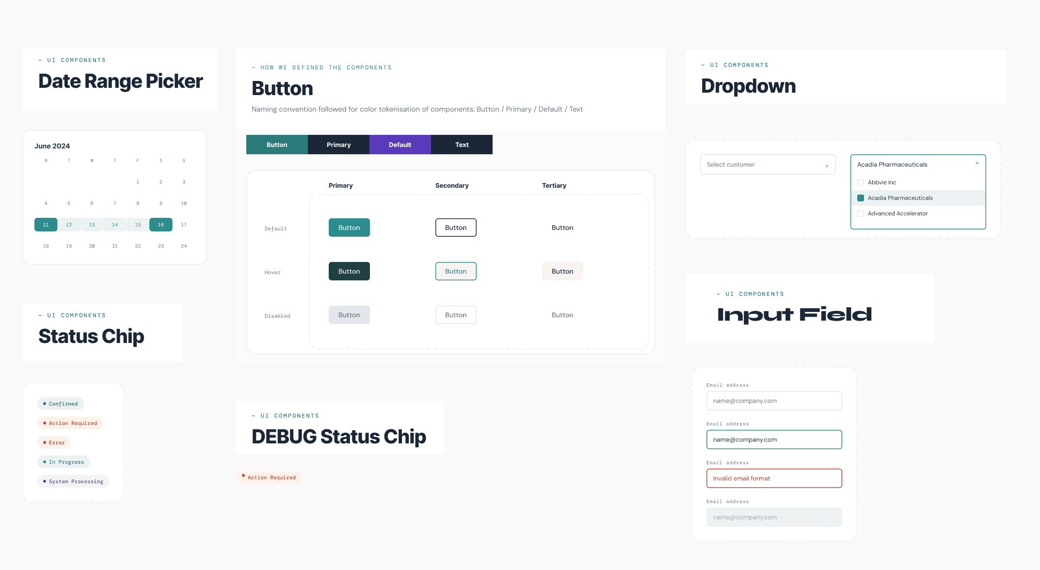
One component. Same meaning. Across every product in the suite.
The Status Chip is the most cross-product component in the library. It appears in RMS resource tables, PeopleAssist AI answer cards, and SDI monitoring screens. The same chip, the same token, the same colour meaning regardless of which product it is in.
THE DESIGN DECISION
I made the call that the same colour can only mean one thing across the entire suite. Green is confirmed. Orange is action required. Red is error or conflict only. That semantic contract is enforced at the token level - the chip component cannot produce an orange "confirmed" state because the token does not exist.
SCREEN 04 - COMPONENT DOCUMENTATION - BUTTON SPEC
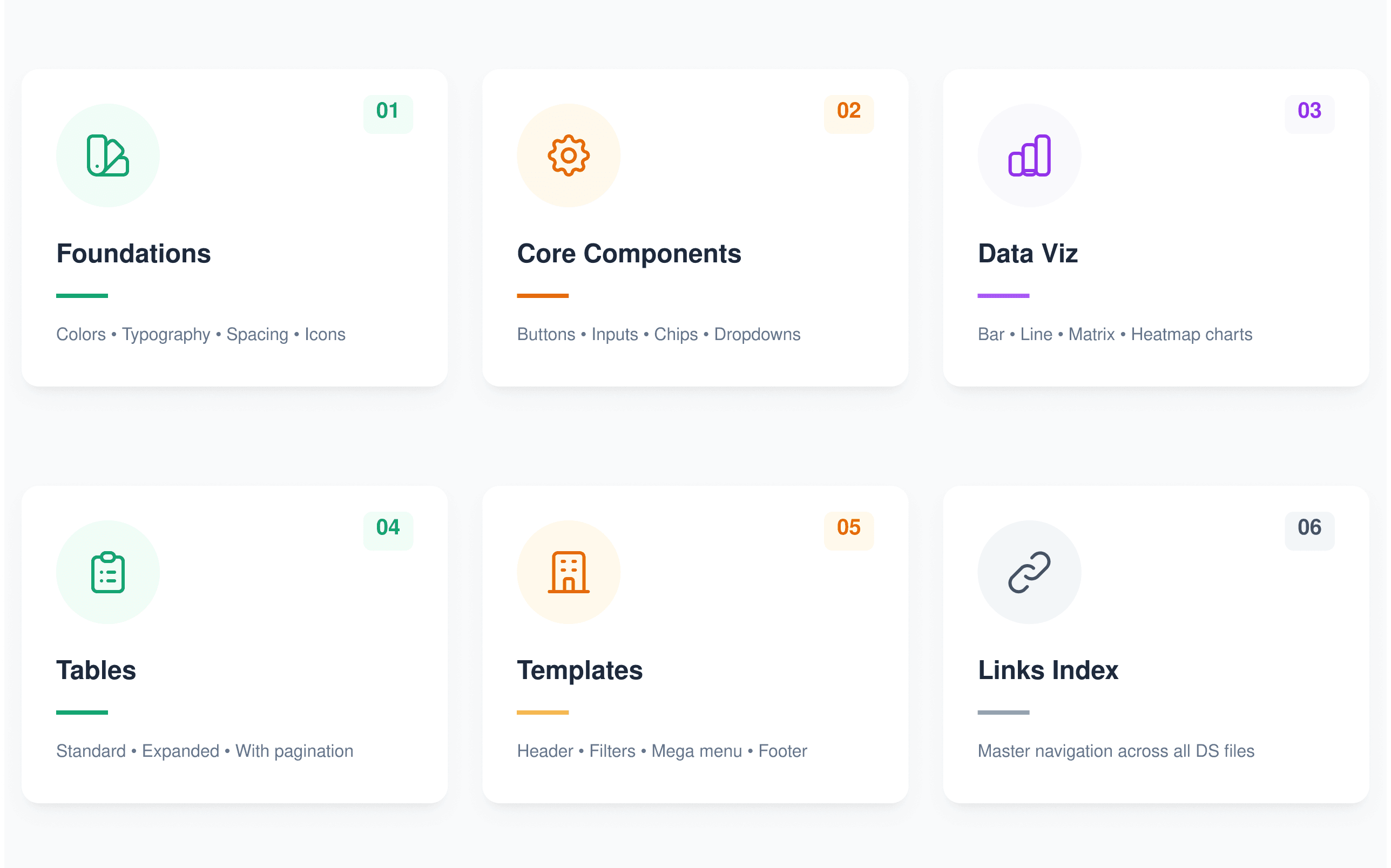
Every component ships with a complete specification. Not a Figma file. A contract.
The documentation format is consistent across every component in the library - variants, states, anatomy, size, style, and detailed measurements. This is what eliminated developer clarification queries. The answer is always in the library.
THE DESIGN DECISION
I treated documentation as a component deliverable, not a handoff step. The naming convention (Button / Primary / Default / Text) is the API between design and engineering. When the developer opens the Figma file, they see a named, versioned, fully specified component not a screen they have to reverse-engineer.
WHAT CHANGED
The team did not get a component library. It got infrastructure that makes inconsistency impossible.
Consistency is now structural, not enforced.
Visual hierarchy and data alignment hold consistent across every product because the system makes the correct choice the only available choice. There is no version of the teal button that is the wrong teal - across any product any designer or engineer touches.
Design sprint time reclaimed from foundational decisions.
Every sprint that used to begin with colour choices, spacing decisions, and component selection now begins at product-level design thinking. We ship the same quality of foundation on day one of every new product in the suite.
Developer clarification queries eliminated for documented components.
The hover state is in the spec. The focus ring is in the spec. The disabled state is in the spec. Engineers implement from a complete contract we agreed on together - not from inference about what the designer intended.
New products launch with a complete foundation on Day 1.
When a team picks up a new product in the suite, they enable the design system library and start with the full foundation immediately. We onboarded multiple product teams this way - the first sprint starts at product design, not at rebuilding infrastructure that already exists.
Token propagation means one change updates everywhere.
A colour update at the primitive level propagates automatically across every semantic token, every component, every product in the suite. What used to require a cross-team update sprint is now a single token change that we agreed on once and maintain together.
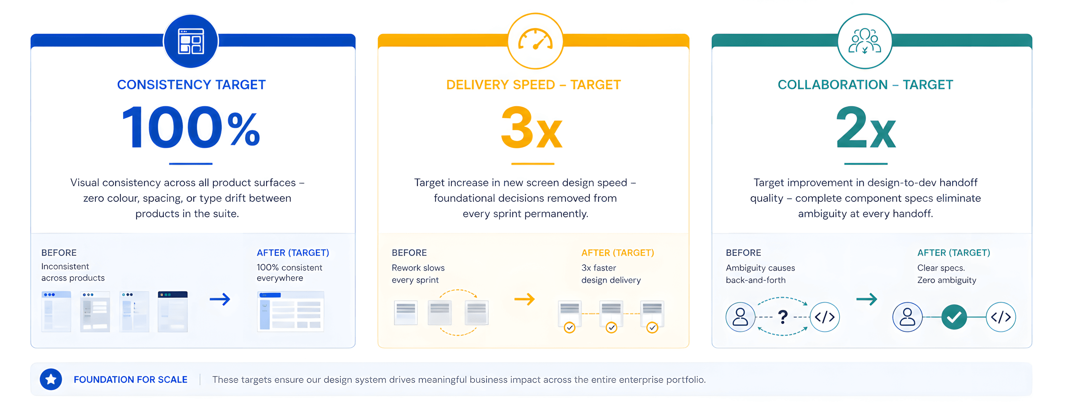
Intended design targets from the brief and stakeholder objectives. Measured outcomes available privately on request.
"A design system is not a project you finish. It is infrastructure you build and then every subsequent product either benefits from, or pays the compound interest on having skipped."
Designing for consistency does not mean removing creative decisions. It means making the right structural decisions once so every creative decision after that starts from a solid foundation.
Full case study
Explore the full system
Audit findings, token architecture, component states, and documentation.
View full case study →
