FinEdge
A self-initiated fintech UX case study unified banking, payments, and investing in one calm, intelligent mobile experience.
Fintech
Product Design
ROLE
Lead Product & Interaction Designer
Scope
4 weeks
TEAM
Self-Initiated Concept Project
Domain
Mobile Application
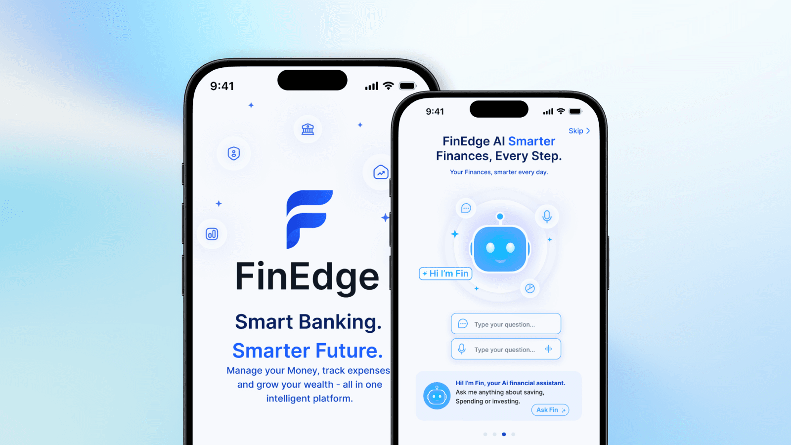

A Financial Ecosystem, Not Just an App
Unlike most fintech apps that solve one problem, FinEdge was designed as a platform where every module shares context, every action is intelligent, and trust is built through transparency.

ROLE | Interaction Designer End-to-End |
|---|---|
PLATFORM | iOS Mobile Application |
TIMELINE | 6 Weeks · Self-Initiated |
DELIVERABLES | UX ResearchUser FlowsIADesign SystemHi-Fi Prototype |
Industry | Finance / Fintech |
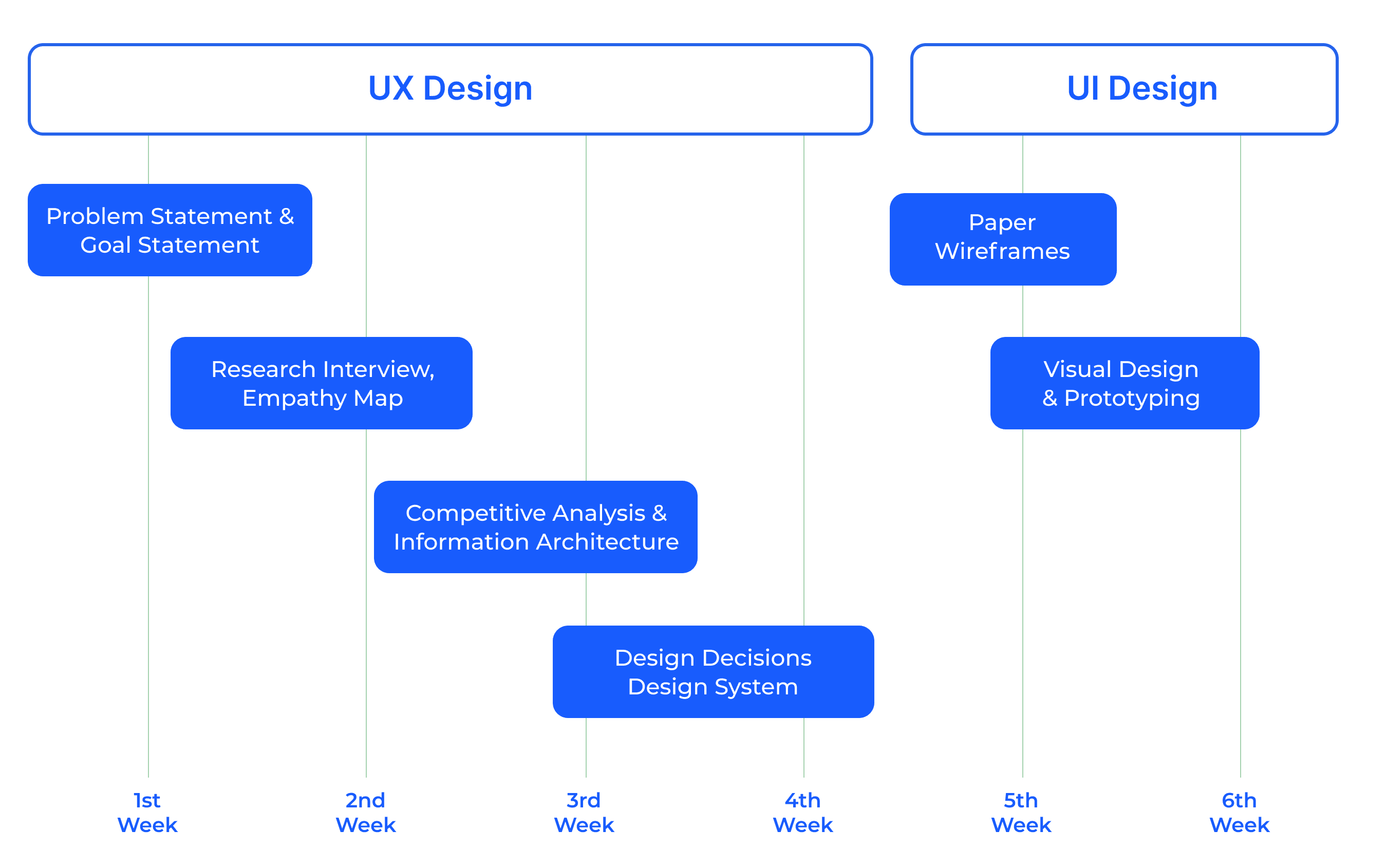
Project Timeline | 6 Week |
CONSTRAINTS | Solo designer · No user testing · Concept only · All metrics are intended impact |
TOOLS | Figma, FigJam, Maze, Notion |
FinEdge reimagines personal finance as one intelligent ecosystem AI banking, smart analytics, secure payments, and guided investing, all in one place.
The Problem
Finance Is Broken for Real People
Despite the proliferation of fintech apps, most users still feel overwhelmed, confused, or disengaged by their financial products. We set out to understand why.
The Problems
Financial data is scattered across 4–6 apps banking, UPI, investments, and expense tracking never talk to each other
Fintech apps react, they don't guide users only discover problems after the damage is done
Investing feels like it's not for me complex jargon and intimidating flows push most users away before they even start
The Opportunities
One home for your entire financial life where every module shares context and nothing feels siloed
From reactive to proactive AI that nudges, alerts, and coaches before things go wrong
Make the first investment feel like an achievement not a risk
Target Audience
FinEdge was designed for modern users who manage banking, payments, investments, and spending digitally.
The primary audience includes:
Young professionals
Freelancers & gig workers
Digital-first users
Small business owners
These users value simplicity, speed, financial visibility, and smarter money management.
Project Timeline
Research
Understanding Real Users
Before designing anything, I listened. Interviews, competitive audits, and secondary research shaped every decision that followed.
Research Methods
Qualitative interviews with 8 fintech users (ages 22–45)- pain points, habits, trust concerns
Competitive audit - CRED, Paytm, PhonePe, INDmoney, Zerodha, Revolut
Secondary research - RBI reports, NPCI data, fintech UX studies
Usability benchmarking of existing onboarding and payment flows
Key Research Findings
73% - Check banking app daily but feel it doesn't actually help them
4.2 - Average number of financial apps a user maintains simultaneously
68% - Never started investing fear and complexity cited as top reasons
89% - Want proactive alerts but current apps only notify after the fact
User Quotes
Interview Participant, Age 27
I have Paytm for payments, HDFC for banking, Zerodha for stocks, and a random app for budget tracking. They don't talk to each other. I feel like my financial life is scattered.
Interview Participant, Age 32
I want my banking app to tell me 'hey, you usually overspend on weekends. here's what happened last week. Right now I just see numbers
User Personas

Define
The Problem Statement

How Might We Questions
HMW 01 - How might we unify all financial data without overwhelming the user with too much at once?
HMW 02 - How might we surface financial insights proactively before problems occur rather than after?
HMW 03 - How might we make investing feel safe and accessible for someone who has never started?
HMW 04 - How might we turn security verification into a trust-building moment rather than a frustrating blocker?
HMW 05 - How might we design an AI assistant that feels genuinely contextual knowing your goals, habits, and history rather than a generic chatbot?
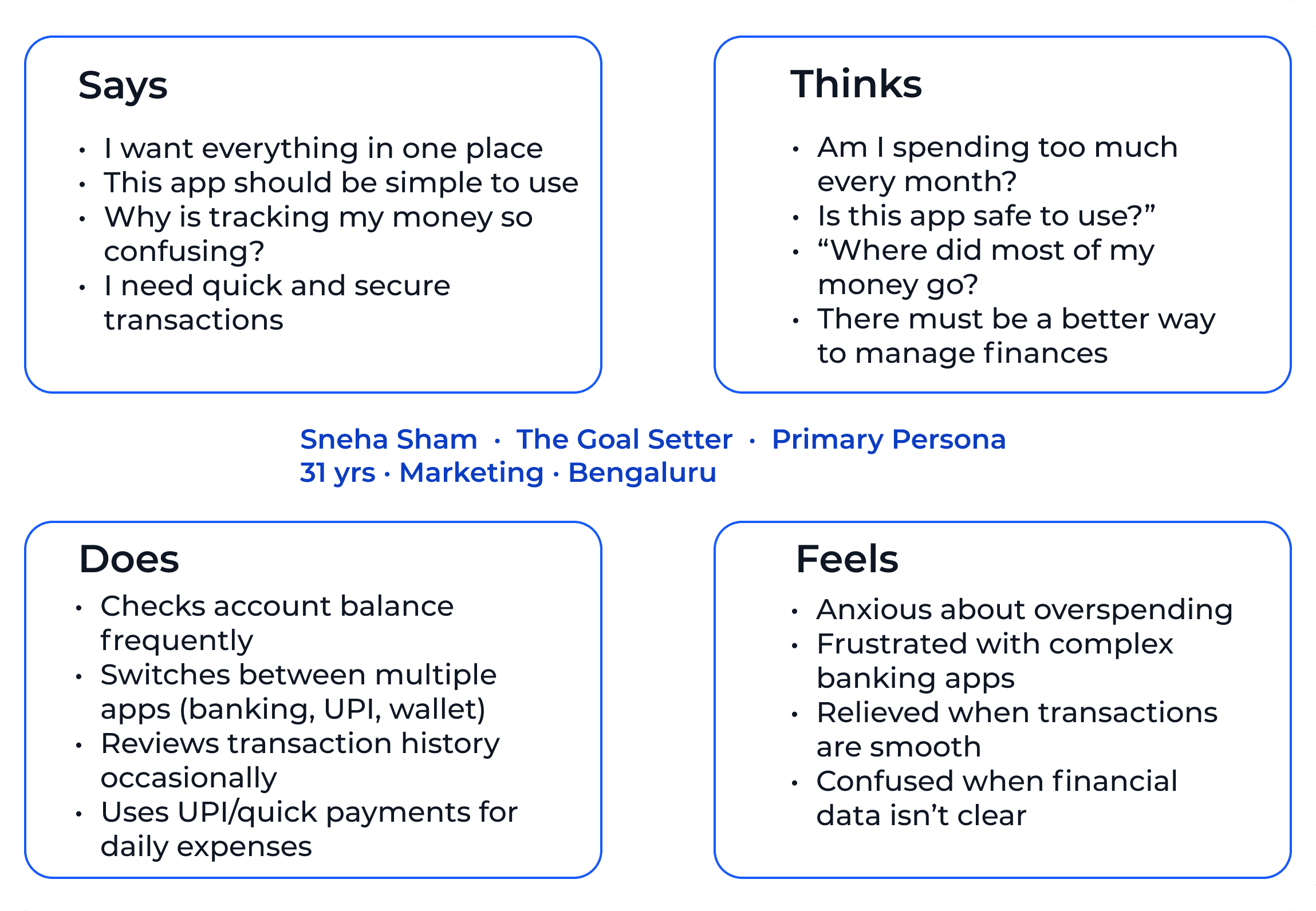
Empathy Map
Inside the User's Mind
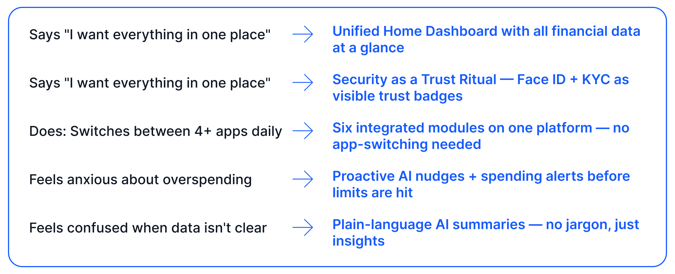
A synthesis of interview insights for our primary persona capturing the emotional and behavioural landscape FinEdge was designed to address.
Key Insights Derived from Empathy Map
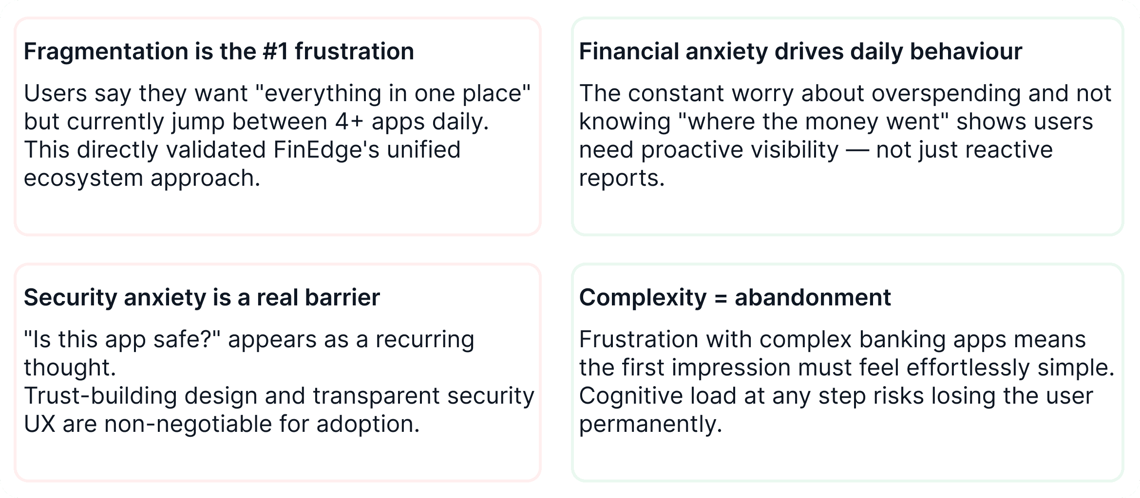
How this Shaped FinEdge's Design
Design Process
How I Got from Insight to Interface
A structured, iterative process grounded in research, tested early, and refined continuously.

Information Architecture
Structuring the ecosystem
Before touching pixels, I mapped the complete product architecture ensuring every module was discoverable, logical, and consistent with user mental models.

Design Principles
Principle 01
Propose, Don't Store - The system should surface intelligent recommendations not require users to assemble insights from raw data. Every view defaults to a suggested action the user can accept, modify, or dismiss.
Principle 02
Trust is Designed, Not Assumed - Every interaction must actively build trust through clear language, visible security, and honest data presentation. If a screen can be read as confusing or suspicious, it must be redesigned.
Principle 03
One Data Layer, Many Views - All six modules read from the same data model. A savings goal set in Wealth becomes a nudge on Home and a budget rule in Analytics the experience feels connected because it genuinely is.
Principle 04
Complexity Earns Its Place - Advanced features exist but are never the first thing shown. Progressive disclosure ensures new users feel calm while experienced users can access full depth nobody is excluded in either direction.
Core Feature
Six pillars of the FinEdge ecosystem
Each feature was designed to solve a specific user pain point and together they form a coherent, intelligent financial platform.

High-fidelity Screens
60+ screens across 8 user flows
From the first onboarding screen to advanced AI interactions every flow was designed to reduce cognitive load, build trust, and reward engagement.


Before & After
What Changed and Why It Matters
The most persuasive section for any hiring manager not what was built, but what problem it solved and how it measurably improved the experience.
BEFORE FINEDGE
Users juggled 4–6 separate apps with no shared context or unified view
Payment status was ambiguous no clear visual states for pending or failed
Investment onboarding required prior knowledge new investors felt excluded
Security flows (KYC, biometrics) were buried and felt like punishment
AI features were generic chatbots not aware of the user's actual data
AFTER FINEDGE
One platform with six integrated modules every section shares the same data layer
Four-state colour-coded payment system Initiated, Pending, Settled, Failed instantly readable
5-step investment onboarding with risk quiz and ₹100 first step designed for first-timers
Security redesigned as trust rituals Face ID and KYC earn visible badges on profile
AI surfaces contextually across Home, Analytics, and Payments not just in a chat window
Design System
Built for trust, scale, and intelligence
The FinEdge Design System was built from the ground up - a cohesive set of colour tokens, typography scales, component patterns, and interaction guidelines that make the product feel like one unified experience across every screen.
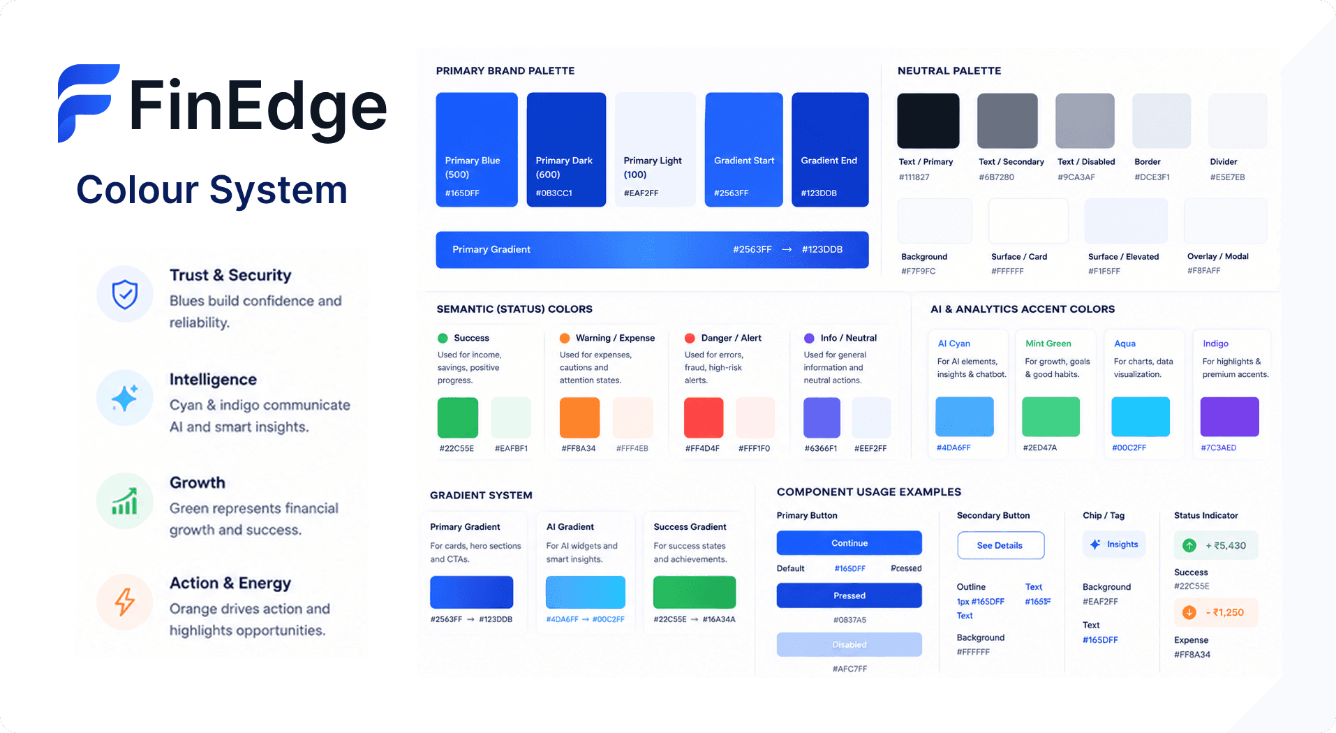
Every colour has a job. Blues build trust, greens signal growth, orange drives action and nothing is decorative.
Colour Philosophy
Blues build trust, greens represent growth, oranges signal action every colour choice is intentional and meets WCAG 2.1 AA contrast standards.
Typography
Built once, used everywhere. A shared type scale kept 40+ screens consistent. Display uses Syne for personality, body uses Inter for readability.
Components
Accessibility wasn't an afterthought it was a constraint that made every decision more intentional. Touch targets minimum 44×44pt throughout.
Typography Scale & Component Library
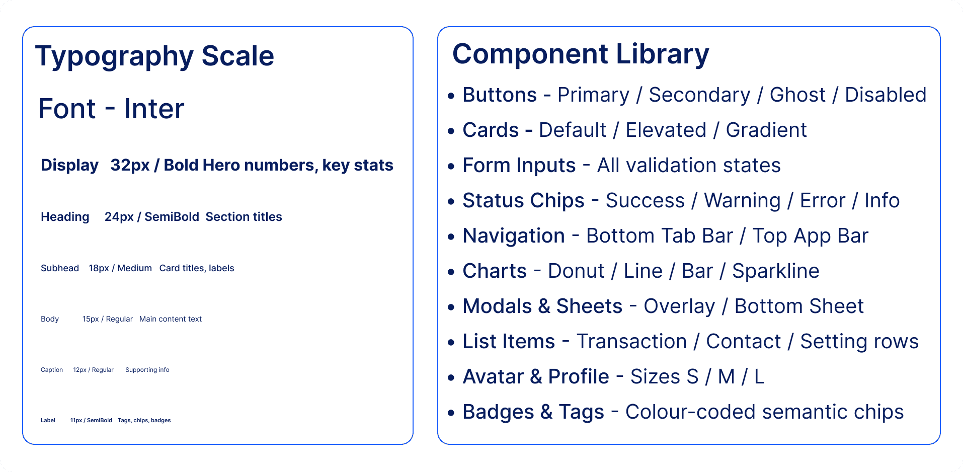
Built once, used everywhere. A shared type scale and component library kept 60+ screens consistent without a single guessing game.
Accessibility
All colour combinations meet WCAG 2.1 AA standards
Minimum contrast ratio of 4.5:1 for normal text
Colour is always used with icons, text, or shapes never alone
Touch targets minimum 44×44pt
Dark Mode ready all tokens designed for both modes
Accessibility wasn't an afterthought it was a constraint that made every design decision more intentional.
Design Decisions
Every Choice Traced Back
to a User Insight
These weren't aesthetic decisions each was driven by a research finding, a user frustration, or a constraint that shaped the solution.
AI as Co-Pilot, Not a Chatbot
FinEdge AI isn't a drawer you open it surfaces across home, analytics, and payments, offering intelligence exactly when it's relevant. Not when you ask.
89% of users wanted proactive guidance, not reactive answers
Security as Trust, Not Friction
Biometric setup and KYC are the most abandoned flows in fintech. We redesigned them as rituals Face ID explains what we protect and why, and every completed step earns a visible trust badge.
Reframing "verify yourself" as "protect yourself" changed completion intent
Investing Starts at ₹100
68% of our users had never invested not because they couldn't afford to, but because the flows felt exclusionary. A simple risk quiz, plain language, and one small first step changed that.
Inspired by Duolingo's start-small, build-confidence pattern
Reflections & Learnings
What I Learned Building FinEdge
This project pushed me to think like a product strategist, not just a visual designer here's what I took away.
System Before Screens
The design system had to come before the screens. Every colour, spacing unit, and component token defined upfront saved enormous time across 40+ screens. Consistency is designed in it doesn't just happen.
Trust is the Product
In fintech, users aren't evaluating your UI they're evaluating whether they trust you with their money. Every decision needs one answer: does this build trust or break it?
AI UX is Still Untapped
Most AI in finance is a reactive chatbot. The real opportunity is proactive intelligence surfacing the right insight at the right moment, without the user ever needing to ask.
Complexity Deserves Clarity
Financial data is inherently complex. The designer's job isn't to simplify reality it's to make complexity navigable. Hierarchy, progressive disclosure, and plain language aren't visual choices. They're UX infrastructure.
FinEdge isn't just a portfolio piece.
It's a point of view.
