Motion Design System
Where Lottie meets fintech crafted for iOS, Android, and 21M+ investors.
Fintech
Lottie Animations
Type
Interaction Designer
Scope
12 Weeks
Platform
Me , 2 Engineers, Product Manager, Inspection Specialists
Domain
Fintech

Overview
Motion in Money
A Lottie-based micro-interaction & onboarding animation system for Paytm Money bringing clarity, trust and real financial meaning to a platform with 21M+ investors.
Role | Interaction Designer |
|---|---|
Scope | Motion System · Lottie Animations · Onboarding |
Platfrom | iOS · Android (Light + Dark) |
Scale | 21M+ Users · 23+ Banners Shipped |
Duration | Dec 2021 - Feb 2022 |

Investing is intimidating.
Motion can make it feel human.
Paytm Money is a SEBI-registered investment platform Stocks, Mutual Funds, F&O, NPS, IPOs, PMS for over 21 million Indians, most of whom are managing wealth digitally for the first time.
For a first-time investor, a dense, static interface feels transactional and cold at the exact moments they need reassurance. My role as Interaction Designer was to use motion as a communication layer not as decoration, but to guide attention, reflect real financial states, confirm actions, and make a high-stakes product feel approachable.
What I worked on
Lottie-based product discovery banners across all major verticals
State-driven portfolio feedback profit, loss, neutral & invest
Light and dark theme variants for every banner
Lifecycle animations app update, ratings, referral
Motion system spec and dev handoff
Tools & format
After Effects + Bodymovin & Lottie Plugin animation authoring
Lottie JSON runtime format for iOS & Android
Figma UX layout, specs, handoff
Paytm Money design tokens Cerulean(#00BDF2), Danube(#5579D1), Tangaroa(#020C2F).
The Problem
Static banners couldn't carry the weight
The home screen used banners to drive product discovery and re-engagement. But static, image-based banners had real gaps I needed to solve.
No hierarchy Every product banner had equal visual weight. Nothing guided the eye to what mattered right now for that user invest, check returns, complete KYC.
Theme fragility Dark mode was on the roadmap. Heavy image assets wouldn't adapt cleanly across themes, screen densities, or low-data conditions.
No sense of state A portfolio up +21% looked identical to one down −8%. The interface didn't reflect the user's actual financial reality.
Performance at scale At 21M users across an enormous range of Android devices, GIF and video would mean heavy payloads, Bank, and battery drain.
Approach
Why Lottie became the backbone of the system
I chose Lottie (vector animation from JSON) as the foundation a decision that solved the design and engineering problems simultaneously.
Lottie renders vector animation at runtime not a raster image or video. That means crisp on every screen, tiny payload, runtime color control for theming, and a clean JSON handoff to engineers with zero quality loss.
Lightweight Every banner is just a few KB. Performance stays smooth across 21M+ low-to-high-end devices.
Themeable Colors swap at runtime one animation source handles light, dark, and multiple data states cleanly.
Dev-friendly JSON exports drop into iOS & Android directly. Designer intent survives the handoff intact.
Hero system · State-Driven Motion
The banner that knows how you're doing
The strongest piece of the system. A single portfolio banner adapts its colour, icon, and motion to the user's live financial state. Same component four emotional states. This is what I'm most proud of on this project.
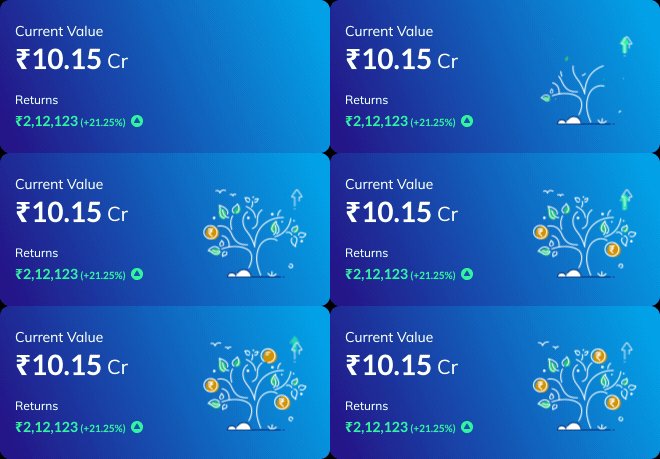
Profit state — upward motion, green tint, rising icon
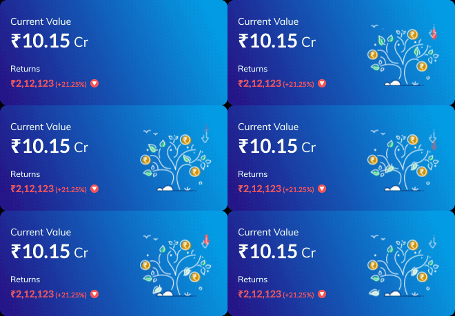
Loss state — settling motion, red cue, downward signal
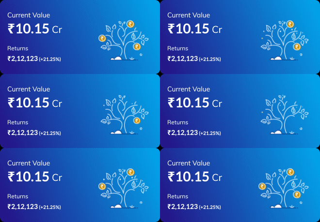
Neutral state — calm, steady, no directional bias

Invest state — growth tree, forward nudge, inviting entry
How the interaction logic works
Front end passes the user's return value and sign to the animation component
Banner selects the matching Lottie state and semantic color token automatically
Motion direction reinforces meaning elements rise on gains, settle on losses
The feedback is legible in under a second even before the user reads the number. Motion does the communicating first.
Hero system · Theming at scale
One animation. Two worlds: light & dark.
Every banner was built to live in both themes from day one not retrofitted later. Lottie's runtime colour control let a single animation source serve both, keeping the system consistent and maintainable as the product grows.
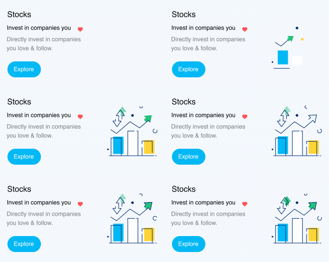
Stocks — Light theme
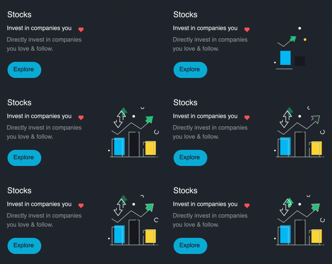
Stocks — Dark theme
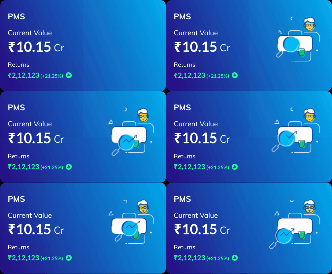
PMS — Light theme
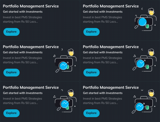
PMS — Dark theme
Colour tokens Cerulean #00BDF2 · Danube #5579D1 · Tangaroa #020C2F map to theme variables, so every banner stays on-brand and accessible regardless of the user's theme preference.
Product discovery banners
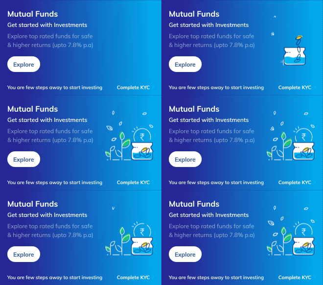
Mutual Funds + KYC nudge - Light theme
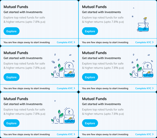
Mutual Funds + KYC nudge - Dark theme
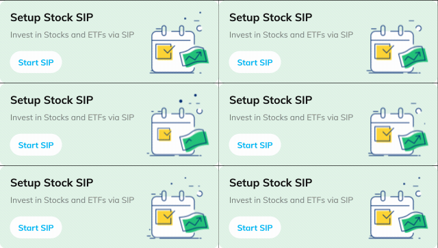
Start Stock SIP
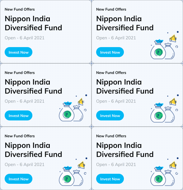
New Fund Offer
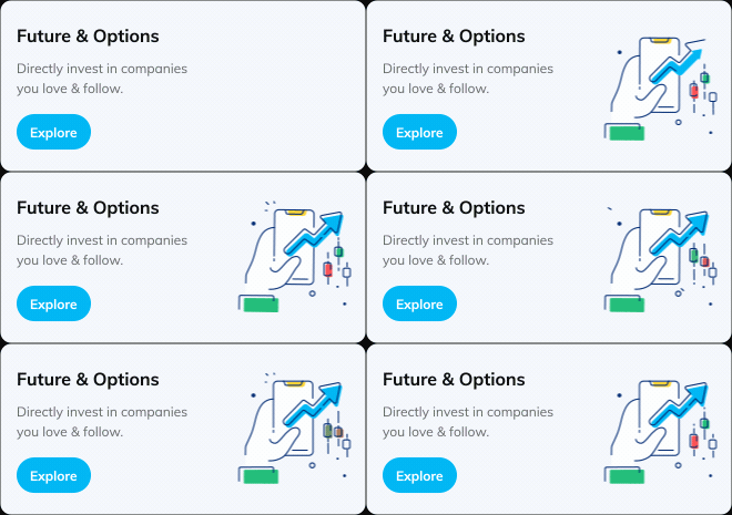
Future & Options - Light theme

Future & Options - Dark theme
Lifecycle & engagement banners
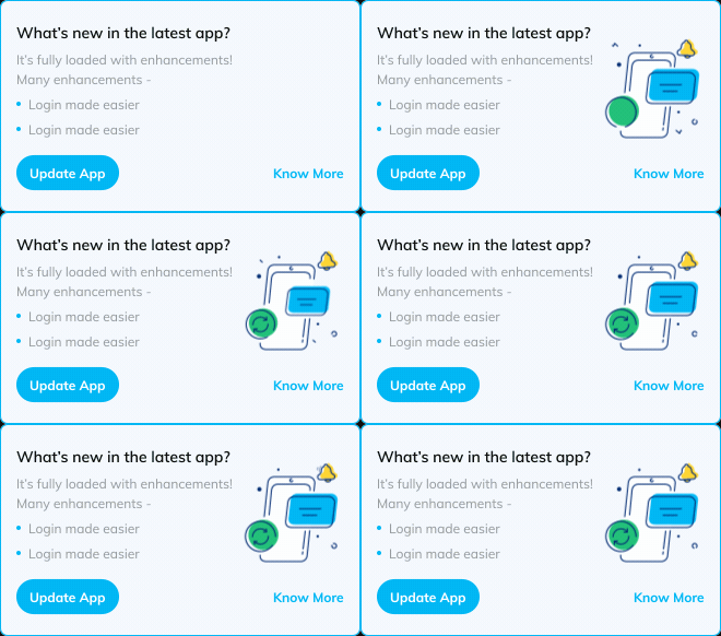
App Update prompt - Light theme
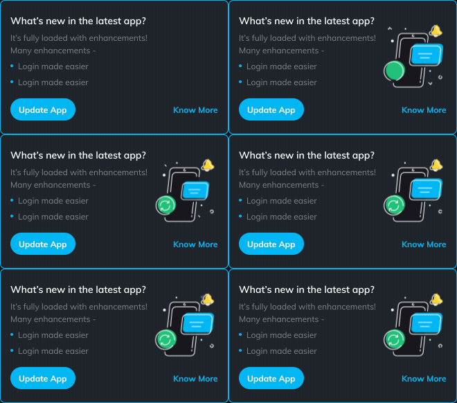
App Update prompt - Dark theme

Refere & Earn
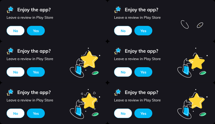
App Rating prompt
Performance & Dev Handoff
Built to run on 21 million phones
A motion system at this scale only works if it's invisible in the right way no Bank, no bloat, no battery drain. I owned the full pipeline from animation authoring to JSON handoff.
Motion system spec :
Format | Lottie (Bodymovin JSON) |
|---|---|
Themes | Light + Dark via runtime colour tokens |
States | Profit · Loss · Neutral · Invest |
Color tokens | #00BDF2 Cerulean · #5579D1 Danube · #020C2F Tangaroa |
Easing | Ease-in-out; directional on state (rise/settle) |
Loop behaviour | Subtle, resolves to rest — never distracting |
Coverage | 21+ banners: Stocks, MF, F&O, NPS, PMS, SIP, NFO, lifecycle |
Why performance matters here
🪶 KB vs MB
Every Lottie banner is a few KB. Video or GIF equivalents would be 50–100× heavier a real cost at this scale.
📐 Resolution-free
One vector asset renders crisp on every screen no @2x/@3x variants needed.
🤝 Zero-loss handoff
JSON exports drop directly into iOS/Android. What I designed is exactly what ships.
Design Principles
The rules behind every animation
These four principles guided every decision from easing curves to whether something should move at all.
Motion with meaning
Every movement communicates something state, direction, or next action. If it doesn't add meaning, it doesn't animate. Period.
Systemic, not one-off
Shared tokens, states and easing make 21+ banners feel like one family and easy to extend as new products launch.
Calm by default
In a finance app, restraint builds trust. Motion is subtle, always resolves to rest, and never competes with the numbers.
Performant & accessible
Theme-aware contrast, tiny payloads, and motion that respects the user's device, connection, and attention.
Outcome - What this Became
Motion as a system, not a finishing touch
What started as individual product banners became a reusable motion language state-driven feedback, dual-theme support, and a performance-first foundation that scales across Paytm Money's entire product surface.
For 21M+ investors, that means an app that feels responsive, trustworthy, and alive at exactly the moments that matter most.
