PEOPLE ASSIST AI
Replacing fragmented HR portals with a conversational AI assistant so every employee gets a direct, trusted answer in seconds, not minutes.
Enterprise HR · AI
Knowledge Management
ROLE
Lead UX + Motion Designer
Scope
6 months · 2023–2024 · Web + Mobile
TEAM
2 UX · PM · Dev · HR
Domain
Web + Mobile · Enterprise


The brief asked for a better search experience.
When I ran the research, I found the real problem wasn't search - employees had stopped trying to find answers themselves. I reframed the entire project around one question: how do you make an AI assistant trustworthy enough to break a habit?
My Role | UX Designer + Motion Designer - end-to-end |
|---|---|
Team | 2 UX designers · PM · Developers · HR team |
Platform | Web (Desktop) + Mobile App |
Tools | Figma · After Effects |
Timeline | 2023–2024 · 6 months |
Status | Shipped · Live enterprise users |
Cross Functional Team | PM, Engineers, HR Content Owners, Compliance stakeholders |
WHAT I WAS BUILDING
An AI assistant that replaces HR portals with direct, trusted answers
PeopleAssist AI is an enterprise HR self-service platform. Employees ask any HR question in plain language benefits, referrals, travel policy, mobility, payroll and receive a single, direct, source-cited answer from the organisation's existing knowledge base.
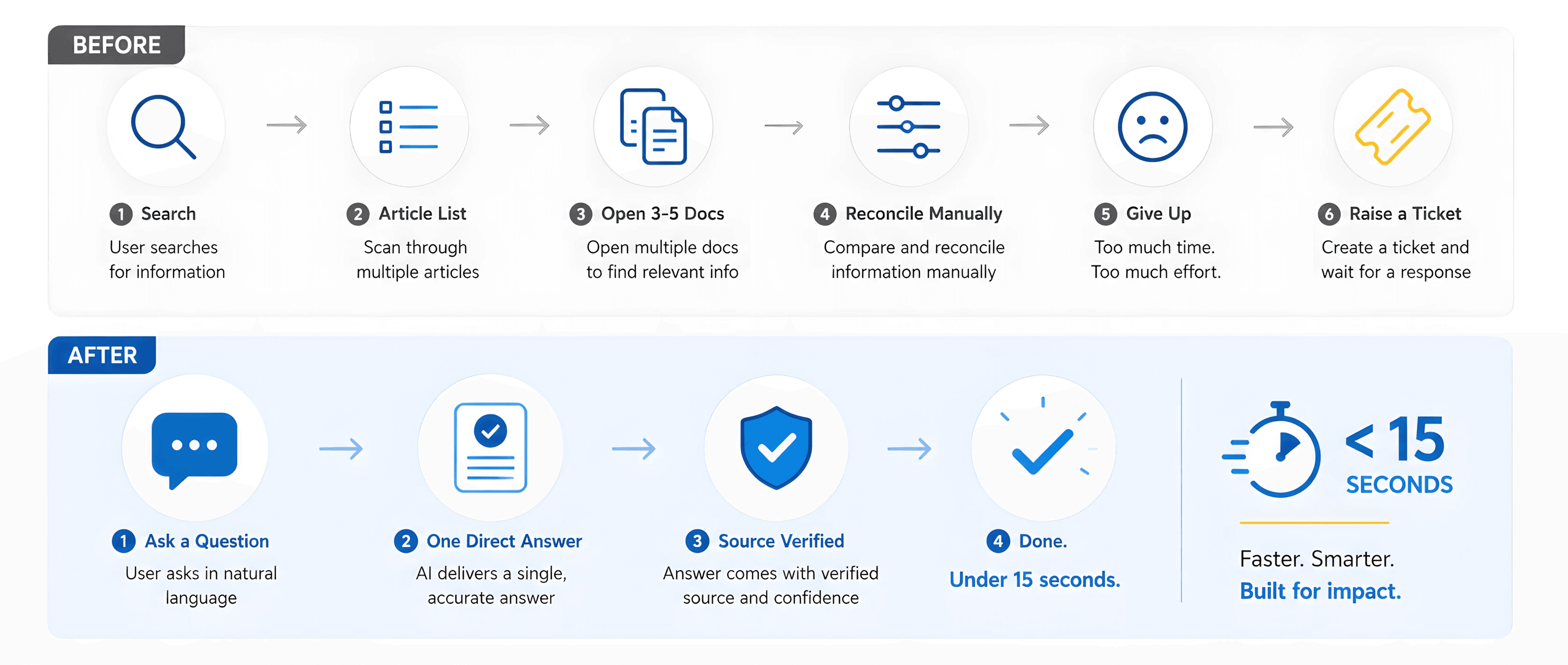
No more opening five articles. No more guessing which category to browse. No more raising a support ticket for a question the system already knew the answer to.
UX Direction: I led the UX direction across a cross-functional team of PM, engineers, HR content owners, and compliance stakeholders. Each brought a different view of what the system needed to do. My job was to hold the design decisions that made it trustworthy - while we aligned the delivery across all of them.
BEFORE VS AFTER
From Complexity to Clarity. From Minutes to Seconds.
THE BRIEF
What the stakeholder asked for
Original ask from HR Leadership
"Improve the employee self-service HR portal. Employees aren't finding what they need. We want better search and navigation."
Standard brief. Reasonable brief. A brief that pointed directly at the wrong solution.
THE BRIEF POINTED AT THE WRONG PROBLEM
Employees hadn't failed at search. They'd stopped trying.
When I analysed HR support emails, I found that most tickets were answerable by content already in the knowledge base. Employees weren't failing at search. They had already decided the portal wasn't worth trying.
Employee surveys confirmed it: the dominant behaviour was raising a ticket after one failed search attempt. Not two. Not three. One.
The reframe I made
The problem wasn't "make search better."
It was "make self-service worth trusting again."
Every decision in PeopleAssist AI flows from that reframe.
HOW I LED IT
Sole UX lead. End-to-end. VP sign-off.
I owned every UX decision from research through engineering handoff. No gaps in my design direction - but delivery was a team effort across PM, dev, and HR.
I led a team of 2 UX designers and worked across a cross-functional group of PM, developers, and HR stakeholders over 6 months. Alignment on scope and direction came through structured workshops we ran together.
I presented at every major decision gate to HR Director and VP level. Sign-off on the reframe, scope additions, and visual system came from the top I made the case, the team executed.
I scoped in mobile when the brief said desktop only. We designed and delivered both platforms together. The mobile decision was mine. The build was ours.

WHAT RESEARCH CHANGED
Four things I found and the decision each one forced
Trust collapse, not search failure
Employees had stopped using the portal months before. One failed search was the lifetime threshold. The product had already lost them.
MY CALL
Reframe the entire project around trust-building, not search improvement.
Source visibility is the condition for action
Employees wouldn't act on an AI answer they couldn't trace. For compliance-sensitive topics pay, mobility, expenses "where does this come from?" was a blocker, not a preference.
MY CALL
Inline source chips on every answer. Clickable. Traceable. Non-negotiable.
Mobile was an invisible gap not in the brief
Field employees needed HR information on-site, in transit, under time pressure. The existing portal didn't work on mobile. Nobody had named this problem.
MY CALL
Scoped in a full mobile product chips instead of search, offline cache, bookmark. Held this against timeline pressure.
The mental model was already conversational
Survey responses and HR emails were phrased as questions, never keyword strings. Employees knew their question. The system made them translate it into keywords. That translation step was where trust died.
MY CALL
Conversational AI input replaces the search bar entirely. The product accepts questions it doesn't demand keywords.
WHERE I CHALLENGED THE BRIEF
Two positions I held under pressure
PUSHBACK 01 · VS ENGINEERING

Engineering wanted escalation in the sidebar. Standard pattern for AI products that don't want users to know the AI can fail.
I put "Still need help? Raise a request" on every single answer card. Visible. Persistent.
One tap from anywhere. Hiding escalation teaches employees the AI doesn't trust itself. That's the opposite of what a trust-rebuilding product needs.
I held this position through two review cycles.
PUSHBACK 02 · VS PM + TIMELINE

The brief said desktop only. Timeline was already tight.
I scoped in a full mobile experience when research showed field employees had zero path to self-service on-site.
Excluding the highest-urgency, lowest-access cohort while claiming to improve "employee experience" was a contradiction I couldn't let stand.
I presented this to the VP directly. It added three weeks. It was the right call.
THE DESIGN DECISIONS
The answer card and the decision it represents
Screen 01 - Answer card, desktop.
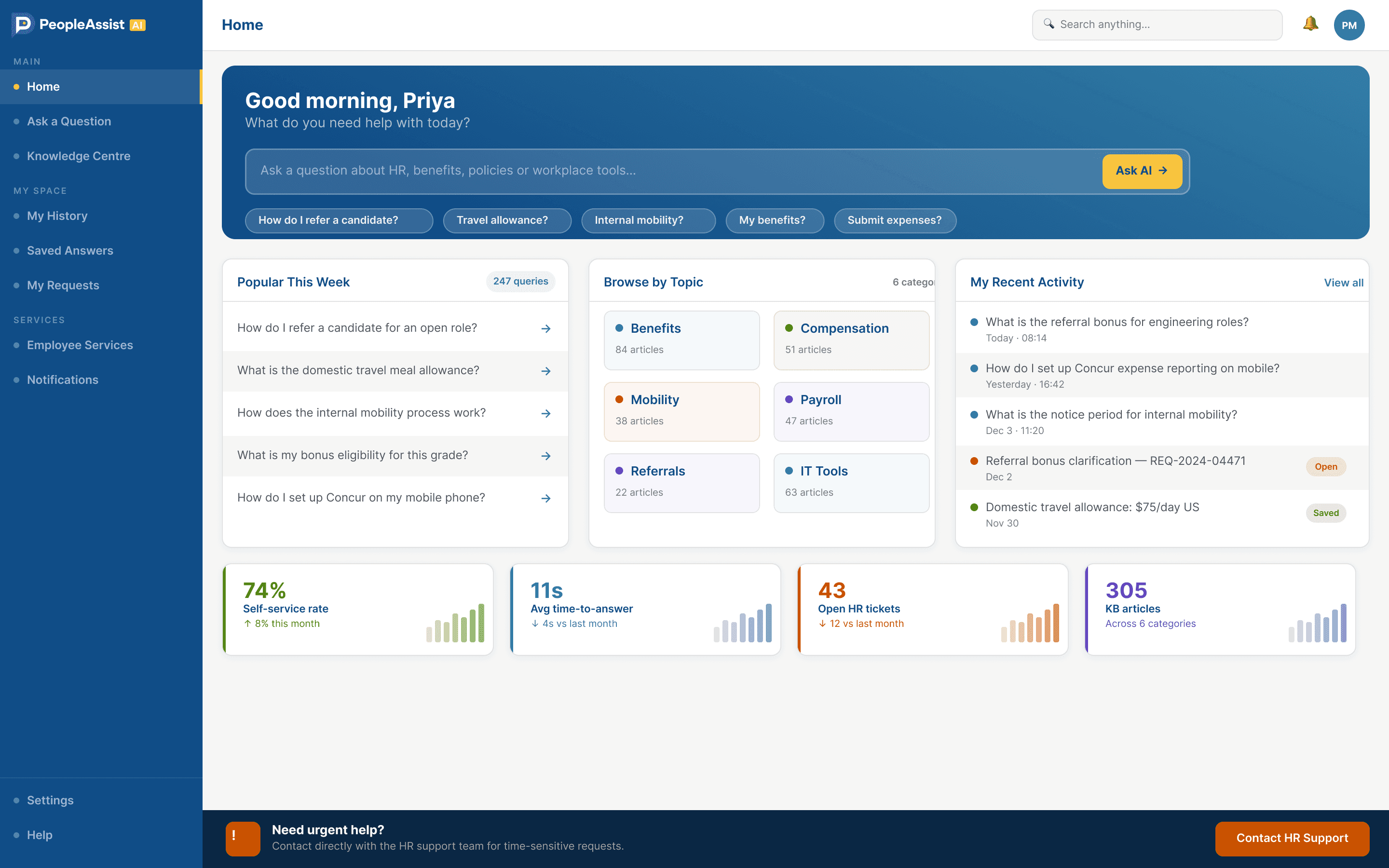
Answer first, source chips second, escalation CTA always in the action row. Engineering wanted escalation in the sidebar. I held it here because employees who didn't immediately see a human support path abandoned the product entirely.
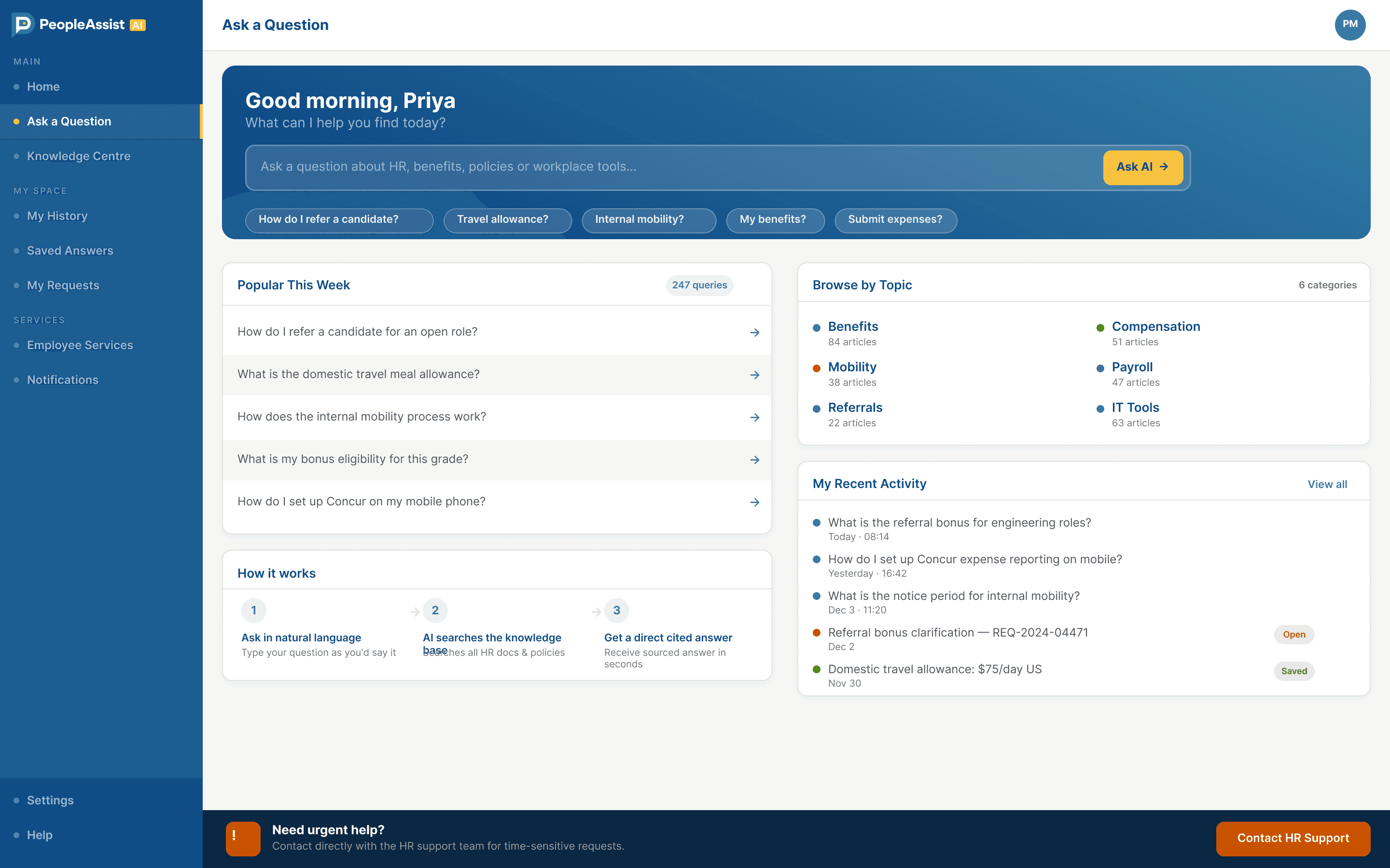
All 14 screens with decision captions desktop

WHAT CHANGED
What changed for the organisation
A habit changed Employees who had stopped using the portal started using it again because the product earned the trust the old one never had.
Field employees got self-service for the first time The mobile experience addressed a gap nobody had named in the brief. On-site access, offline cache, chip-based input. First time field workers could self-serve without a laptop.
Compliance anxiety resolved Source citations were the design decision that made AI-generated HR answers legally acceptable. Previous AI implementations had been blocked. This one wasn't because employees could trace every answer to its source.
HR team shifted from reactive to proactive The KB gap dashboard turned repetitive ticket-answering into proactive knowledge management. Not a UX feature a workflow transformation.
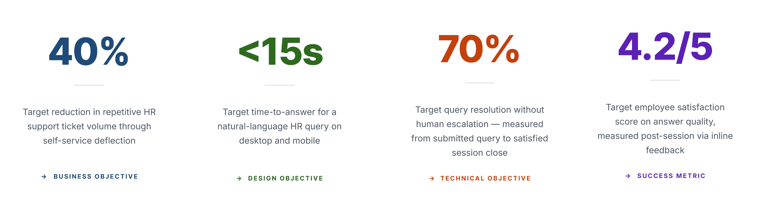
TURNING THE PRODUCT INTO A STORY
After the UX shipped I made the product video
Once the platform launched, adoption was the next problem. Employees needed to see what PeopleAssist AI could do before they would try it. I made the call to create a product showcase video using the actual screens we had designed and shipped together.
What I Built
A product video built on the real screens showing the full employee journey from asking a question to receiving a cited answer cut together to demonstrate the value of the platform in under two minutes.
Real screens, real product - The video used the actual Figma-designed screens not illustrations or placeholders so employees saw exactly the interface they were about to use.
Internal voice deliberate decision - I directed a colleague from the same project team to record the voiceover. Someone who had lived the problem firsthand. Their voice carried credibility that a professional narrator never could employees heard a peer explain the product, not a marketing script.
Edited and directed end-to-end - I edited the voiceover, cut the video against the screen recordings, and delivered the final product video for internal launch communications. Motion and UX same person, same project.
FULL CASE STUDY
Every decision. Every screen. Every pushback.
The full depth version research methods, all 6 user flows, information architecture, style guide, all 14 screens with captions, and the one call I'd make differently.
View full case study →
