
Popcorn Review
From Wireframe to Motion Designing Popcorn Review End to End with a Teaser video (Motion Design)
Entertainment
Media
Type
UX & Motion Designer
Scope
12–14 weeks
Platform
2 Dev & 1 Designer
Domain
Entertainment · Ticketing · Reviews

Overview
Popcorn Review is a startup mobile app that brings together movie discovery, crowd-sourced reviews, and cinema ticket booking in one cinematic experience. Designed end-to-end at Perdix Business Solutions from information architecture and UI screens to a motion teaser video as the sole designer on the project
Industry | Entertainment · Ticketing · Reviews |
|---|---|
Team | 2 Dev & 1 Designer |
Platform | Mobile App (iOS & Android) |
Role | UX & Motion Designer |
Project Duration | May 2014 - Sep 2014 |
Objective
Design a mobile-first entertainment platform that reduces the discovery-to-booking gap for Indian moviegoers combining reviews, personalisation, and ticketing in a single cohesive experience.
Stakeholders
Startup founders (product vision, investor readiness)
Target users: Urban moviegoers, 18–35, smartphone-first, India
Development team (interaction specs + handoff)
Success Metrics Defined
Onboarding completion rate target: >70%
Booking flow drop-off: reduce to under 2 steps from decision to seat selection
Review submission rate: at least 1 in 5 users post-viewing
Motion teaser: used in 3+ investor pitch decks
App icon and brand identity signed off by founder in under 2 revision rounds
What is Popcorn Review?
Movie discovery, community reviews, and cinema ticket booking in one place. Built for people who take their movies seriously.
The market had two dominant players pulling in opposite directions. BookMyShow owned the transaction. IMDb owned the knowledge. Neither felt personal, expressive, or community-forward. Popcorn Review was designed to close that gap.
At Perdix Business Solutions, I owned the entire design scope UX research, information architecture, UI screens, interaction design, and the motion teaser video. One designer. End to end.
Product Scope
The Popcorn Review app was built to to serve five core user needs:
Discovering new movies by genre, trending, and personalised recommendations
Reading and writing crowd-sourced reviews with a star-rating system
Checking cinema showtimes and available screenings nearby
Booking movie tickets directly within the app
Sharing reviews and recommendations across social platforms
Project Goals
Specific Design a cinema discovery + review + booking mobile app for urban India, owned end-to-end by one designer
Measurable Deliver 30+ screens, 5 core user flows, 1 brand motion teaser, 1 interaction spec document
Achievable Single designer with BSc Multimedia background covering UX + motion scope
Relevant Addresses a real market gap between BookMyShow (booking only) and IMDb (content only)
Time-bound 12-week design engagement at Perdix Business Solutions
Research & Competitive Analysis
Understanding the landscape
Before sketching a single screen, I spent time understanding what users actually needed and where existing platforms were falling short. Two tracks: competitive product analysis and direct user insight.
What the research surfaced
Context-switching fatigue users opened multiple apps to decide what to watch, check reviews, then book. The journey was fragmented.
Review credibility gap aggregate scores felt impersonal. People trusted what friends said, not a number from thousands of strangers.
Discovery was date-driven, not taste-driven existing apps showed what was new, not what was right for you.
Booking felt disconnected the transactional UI killed the excitement of the decision to go.
No personality neither dominant app had a distinct brand voice or visual delight.
BookMyShow owned the booking transaction. Efficient but cold — utility-first, no personality, weak discovery, reviews as an afterthought. No motion language in the product whatsoever.
IMDb's app was the authority on movie information rich with data and critic scores but dense and hard to browse. No ticket booking for the Indian market. No social layer. No brand warmth.
Feature Comparison Matrix
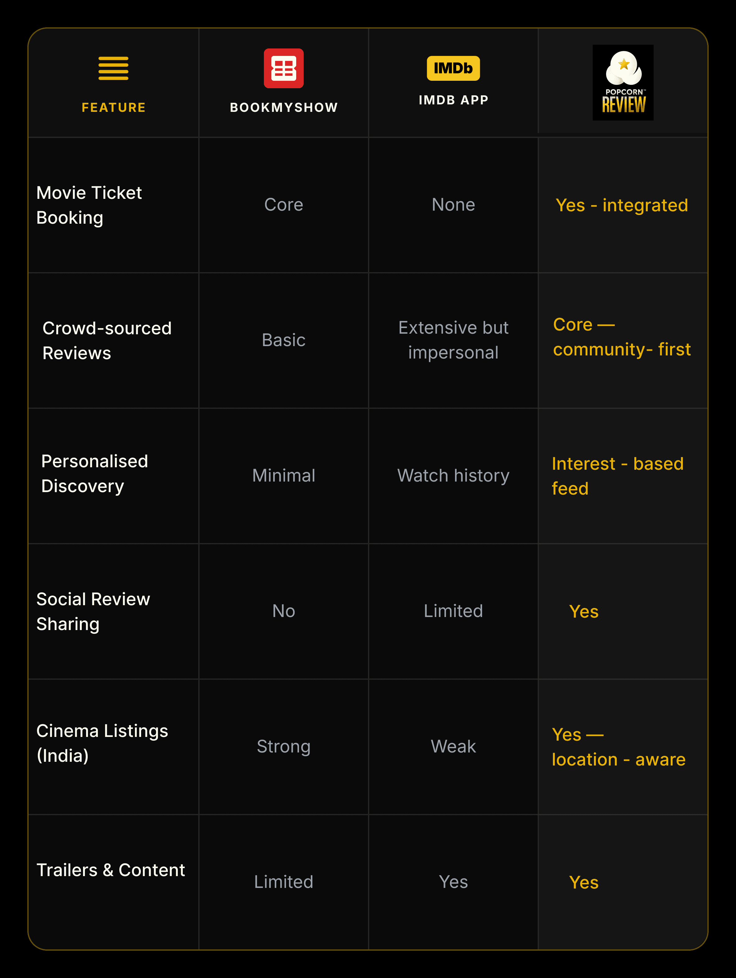
No single product in the market had combined the transactional power of BookMyShow with the content depth of IMDb wrapped in a brand that felt alive. Design Brief Insight
Key finding: Users needed one app to go from "what should I watch" to "I have a ticket" no such product existed in India.
Designing the experience
Every screen had one job: make the next step feel obvious, and the whole journey feels like something you'd want to do again.
Information Architecture
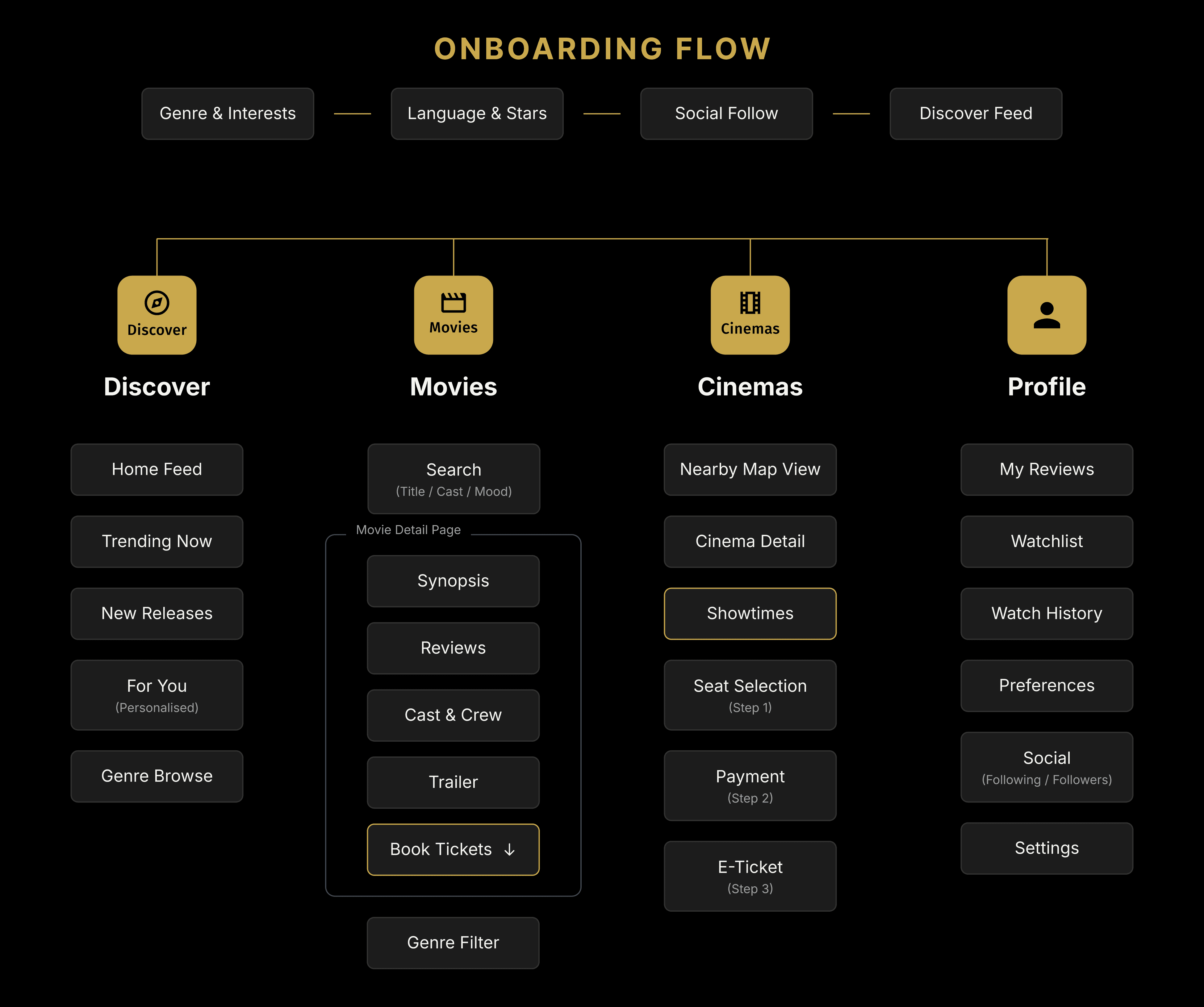
The app was organised around four primary navigation pillars each mapping directly to a user need surfaced in research:
Implementation Approach
The solution was built in two sequential phases to manage the dual UX and motion scope within a single-designer constraint.
Phase 1 - UX Foundation (Weeks 1–6): Competitive audit → user interviews (8 participants, guerrilla testing at PVR Bangalore) → affinity mapping → IA and navigation model → 30+ wireframe screens → usability walkthrough → visual design system.
Phase 2 - Visual & Motion (Weeks 7–12): Brand identity (logo, colour tokens, type scale) → high-fidelity UI screens for 5 core flows → interaction spec documentation → After Effects motion teaser (9 scenes, 33 seconds) → micro-animation spec sheets for developer handoff.
The key unique decision: booking was embedded inside the movie detail page rather than as a separate section — collapsing a 3-app journey into a single scroll.
Key design decisions
Booking lives inside the movie page, not in a separate section. This was a deliberate IA choice that closed the discovery-to-booking gap the most significant friction point identified in research.
Reviews come before the booking CTA. Social proof and community opinion placed above the action button — reinforcing that this app is about conviction, not impulse.
Onboarding was preference-first. At first launch, users selected genres, languages, and favourite directors. This seeded the recommendation algorithm from day one, so the Discover feed felt personal from the very first scroll.
Key decision: Booking inside the movie page, reviews before the CTA, preference-first onboarding. 30+ screens across 5 flows.
Key flows designed
Onboarding: Interest selection, genre preferences, social follow suggestions a 3-screen setup that felt like being asked what you like rather than filling out a form
Movie Discovery Feed: Infinite scroll, card-based layout, star ratings at a glance, genre tags, and quick review previews
Movie Detail Page: Poster hero image, synopsis, aggregate rating with breakdown, user review stream, cast grid, trailer link, and sticky booking CTA
Review Submission: 5-star tap-to-rate, freeform text with optional spoiler tag, character countdown, social share toggle
Booking Flow: Showtime selection → seat map → payment summary → e-ticket with QR code reveal animation
Loading States: Cinema-themed animations popcorn filling, reel spinning to make every wait state feel like the app, not a system default
High Fidelity Screens
The UI committed fully to the cinema environment. Dark backgrounds (deep black and near-black charcoal) evoke the darkened theatre. Gold is reserved for ratings, CTAs, and brand accents — it earns its place, never decorative. White text reads like a screen in a dark room.
Card components used subtle elevation without heavy borders. Typography paired a bold geometric display face for titles with a humanist body face for reviews — cinematic authority meeting reading comfort. The three-kernel logo mark and dimensional gold star were carried through into app icon, loading states, and empty screens to maintain brand coherence at every touchpoint.

The teaser video
33 seconds. 9 scenes. No UI screens. No voiceover. Just cinema objects, moving telling the whole story through motion alone.
The Popcorn Review teaser was produced in Adobe After Effects as a short-form animated brand film. The brief: create something usable across social media, app store previews, and investor presentations without showing a single app screen. Instead, the film communicates the product's purpose through objects that define the cinema experience, culminating in the final logo reveal.
The final logo reveal was the payoff the entire teaser built toward three popcorn kernels, a gold star, and a name in metallic gold that felt like it belonged on a marquee.
Motion principles applied
Anticipation and squash-stretch on the ticket and glasses drops weight and material communicated through motion
Custom easing per object the ticket floated before landing (light, papery); the glasses fell with a definitive thud
Deliberate pauses after each reveal viewer registers each message before the next element appears
White fade transitions between scenes each object gets its full moment, no visual clutter competing
24fps a deliberate film-world choice, not broadcast-feel 30fps
Key output: A 33-second brand teaser with zero UI screens communicating the full product story through cinema objects alone.
Challenges & How I Solved them
What made this hard
One Designer, Two Disciplines UX and motion require completely different mental modes. The fix: sequential phases. UX research and architecture first, visual design and motion second. Both phases shared the same brand system so the handoff was to myself.
No Established Design System No dark-themed, entertainment-focused component library existed. Built everything from scratch spacing scale, type ramp, colour tokens, icon set. The logo's palette became the design token foundation.
Stakeholder Communication Static screens couldn't convey a motion-forward product to non-designers. The teaser video did that job instead the logo reveal at the end became the anchor moment everyone remembered and referenced.
Booking Flow Complexity Cinema seat selection, showtime filtering, and payment on a 5-inch screen is inherently hard. Solution: a strict 3-step wizard, colour-coded seat grid, one primary action per step. No competing choices at any stage.
Motion Without a Pipeline No standard After Effects-to-mobile pipeline existed. Detailed interaction documents with easing values, durations, and frame breakdowns replaced asset exports. Developers built directly to spec.
Key learning: Every constraint no system, no pipeline, no team forced a more intentional decision. That's where the quality came from.
Outcomes & Impact
30+ screens designed across 5 complete user flows
9-scene, 33-second HD motion teaser used in
Booking flow reduced to 3 steps (vs. competitor average of 5–7 taps to reach seat selection)
Onboarding designed to seed personalisation from session 1 no cold-start blank feed
Interaction spec document enabled developer handoff
Solo designer delivered work equivalent to a UX designer + motion designer 2 roles, 1 person, 12 weeks
Popcorn Review is where I first understood that UX and motion are not two different jobs. They are two expressions of the same design intention and the logo proved it.
CHARAN RAJ — LEAD UX & MOTION DESIGNER
Lessons Learned
Constraints sharpen decisions. No design system meant every spacing, colour, and component choice was deliberate. You can't inherit a pattern you don't understand. That discipline carried into every project after this.
The logo is not decoration it's a brief. The three-kernel mark and gold star informed the loading animation, the rating icon, the empty states, and the teaser finale. When brand identity is designed alongside the product, they speak the same language. When they're separate, you spend the rest of the project translating.
Motion earns trust faster than copy. The teaser communicated the full product proposition in 33 seconds no UI screens, no voiceover. Stakeholders understood what the app was before seeing a single wireframe. Motion is the fastest way to transfer conviction.
Guerrilla testing beats no testing. 5 users at a multiplex with printed screens produced more actionable insight than any formal report. Real context they'd just watched a film, they were in the mood produced real reactions. Don't wait for a lab.
