Project Pulse
A role-based real-time dashboard that replaces fragmented spreadsheet reporting for project managers and executives.
Enterprise SaaS
Process Intelligence
ROLE
Lead UX Designer (Solo)
Scope
Jan – Aug 2024
TEAM
Me · 1 PM · Stakeholder review
Domain
Enterprise Web Dashboard


The brief asked for a better reporting tool. The real problem was trust.
Executives were calling PMs every week to verify dashboard data before acting on it. The data wasn't wrong. The system gave them no proof it was current. I reframed the design from report generation to data trust as the product.
Role | UX Designer Solo · Concept project based on real enterprise challenges |
|---|---|
Industry | Enterprise Saas |
Project Duration | Jan - Aug 2023 |
Cross Functional Team | PM, Engineers |
THE PRODUCT
One platform. Two roles. The same data, seen completely differently.
Project managers need to triage blockers, track sprint progress, and flag at-risk tasks before they escalate. Executives need a 30-second portfolio scan that tells them which projects need their attention right now. Before Project Pulse, both roles were using the same flat spreadsheet report and neither got what they actually needed.
BEFORE VS AFTER
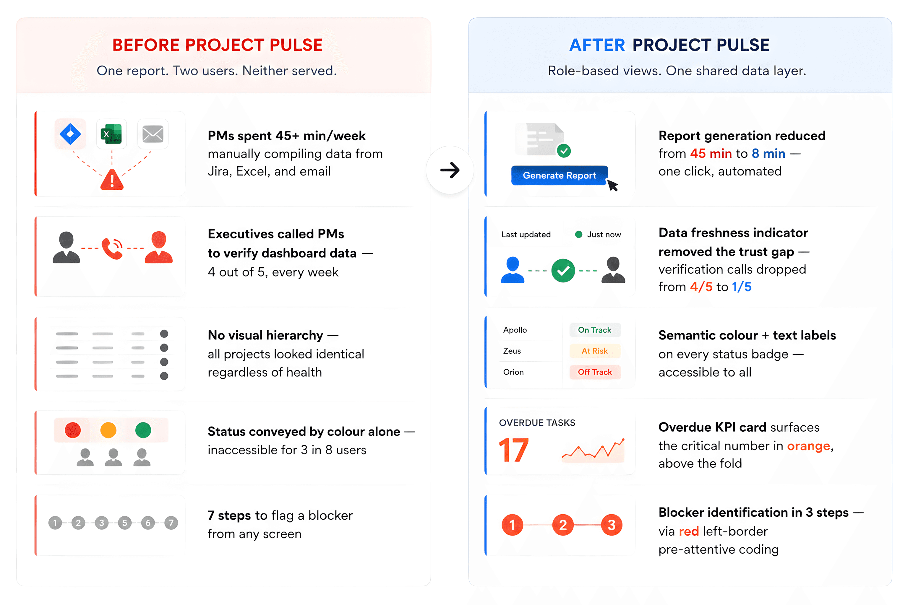
THE BRIEF
What the stakeholder asked for.
"Build a dashboard that replaces our spreadsheet reports. Project managers need better tracking. Executives need visibility. Make it faster to generate the weekly report and easier to see project status at a glance."
Clear brief. Reasonable scope. A brief that diagnosed the symptom, not the disease.
THE REAL PROBLEM
The spreadsheet was not the problem.
The trust gap was.
THE REFRAME
"Show the right person the right signal at the right moment — and make them confident enough to act on it without picking up the phone."
Research in week 2 showed something the brief hadn't named. Executives weren't calling PMs because the dashboard was slow. They were calling because they had no way to know whether the data they were looking at was ten minutes old or ten days old. A data freshness problem was masquerading as a design problem. Once I reframed the brief, every decision that followed had a different anchor: not speed, but trust.
I presented this reframe to the PM in week 3 with supporting research. It was accepted without revision. That reframe is the foundation every design decision rests on.
HOW I LED IT
Sole designer. Research through handoff. Every decision was mine to make and defend.
Sole designer on the project - I defined the research strategy, ran the sessions, synthesised the findings, and owned every design decision from the first wireframe through engineering handoff. The PM reviewed. The call was mine.
5 stakeholder interviews personally - PMs and senior executives. I structured the sessions around the gap between the brief I was given and the trust problem I suspected was underneath it. Research confirmed what I suspected.
Card sort with 8 participants - to understand how each role mentally organises project information. Executives group by outcome. PMs group by workflow. One IA cannot serve both. This was the data behind the role-split architecture decision.
Presented the reframe at Director level - the brief said "better reporting tool." I made the case for redesigning around data trust. Sign-off came without major revision because the research made the reframe inevitable, not surprising.
Ran usability testing with both user groups simultaneously - not sequentially. A design that worked well for PMs often fell flat for executives, and vice versa. Testing both in the same round caught conflicts early enough to fix them before engineering started. That decision produced the insight that the left-border blocker signal which PMs loved was invisible to executives scanning at the portfolio level. I designed around both.

WHAT RESEARCH SHOWED
Four findings. Each one led directly to a design decision.
Findings tell you what happened. Insights tell you what to design. Here is both — and the call I made because of each.
FINDING 01 - TRUST
Executives were calling PMs to verify the dashboard. Every week.
4 out of 5 executives interviewed said they called the project manager directly after viewing dashboard data before making any decision based on it. The data wasn't wrong. There was no way to know whether it was current.
MY CALL
I designed a persistent data freshness indicator "Last updated 2 minutes ago · All sources connected" as a first-class UI element, always visible above the KPI row. Not a tooltip. Not a footer. Front and centre, because trust is not a nice-to-have in a decision-support tool.
FINDING 02 - TWO MENTAL MODELS
Executives group by outcome. PMs group by workflow. One IA cannot serve both.
The card sort revealed a structural mismatch. Executives organised information by portfolio health "what needs my attention?" PMs organised by task state "what's blocked, what's at risk, what's on track?" The same navigation design would always fail one of them.
MY CALL
I designed a single shared data layer with two role-specific views. The Executive Dashboard surfaces 4 KPI cards, a trend chart, and a team performance table. The PM Task View surfaces blockers first, groups tasks by urgency, and puts triage tabs front and centre. Same data. Different moments of use.
FINDING 03 - TRIAGE FIRST
PMs want to see blockers before they see everything else.
Every PM interviewed said the same thing in different words: show me what's on fire first, then I'll look at everything else. The existing flat task list forced them to scan the entire list to find the two tasks that actually needed their attention right now.
MY CALL
I designed a triage tab system All (22) · At Risk (5) · Blocked (3) as the primary navigation for the PM view. Blocked tasks use a red left-border as a pre-attentive signal. The PM eye goes straight to the critical item. Blocker identification: 7 steps before, 3 steps after.
FINDING 04 - COLOUR ALONE FAILS
3 in 8 participants had some degree of colour-blindness.
The existing system used colour as the only status signal. Red meant critical. Green meant on track. For 3 participants, that distinction was invisible. They were making decisions based on incomplete information without knowing it.
MY CALL
Every status badge in Project Pulse pairs colour with a text label. No exceptions. Orange + "High" · Amber + "Medium" · Green + "Low" · Blue + "In Progress." Colour reinforces meaning. Text carries it. Accessible to all users from day one not retrofitted later.
RESEARCH QUOTE
"I spend more time making the report than actually managing the project."
This quote came from the second PM interview. By the time I heard a version of it in the third interview, I knew it wasn't an individual complaint — it was a systemic design failure. PMs were doing data assembly work. The tool was supposed to do that for them.
WHAT THIS DROVE
The automated report generation feature — one click, all sources pulled, report ready in under 8 minutes — is a direct response to this finding. The design removes the assembly work so the PM can focus on the judgment calls they were hired to make.

WHERE I PUSHED BACK
Four positions I held or took without being asked.
PUSHBACK 01 — VS PM
The data freshness indicator had to be permanent not a hover state.
"The freshness indicator adds visual noise. Can we put it in a tooltip or make it only show when data is stale?
I HELD THIS POSITION
Trust is not conditional. An indicator that disappears when everything is fine does not solve the trust problem — it reintroduces it. Executives need to see that the data is current, not just be warned when it isn't. The indicator stays visible, always, in the same position. That is what eliminates the verification call.
PUSHBACK 02 — VS ENGINEERING
The KPI Overdue card had to use orange not grey like the others.
"All four KPI cards should use the same style for visual consistency. Colour-coding one differently breaks the pattern."
I HELD THIS POSITION
Consistency is not the goal. Clarity is. If all four KPI cards look identical, the executive has to read all four to find the one that matters. Overdue in orange breaks the pattern deliberately — because the overdue number is the only KPI that demands immediate executive attention. Sameness would cost them seconds every time they open the dashboard.
PROACTIVE DECISION 03 — NOT IN THE BRIEF
I added the year-on-year trend chart without being asked.
The brief asked for a chart showing current project performance. A single line showing this month's numbers.
I ADDED DUAL-LINE COMPARISON
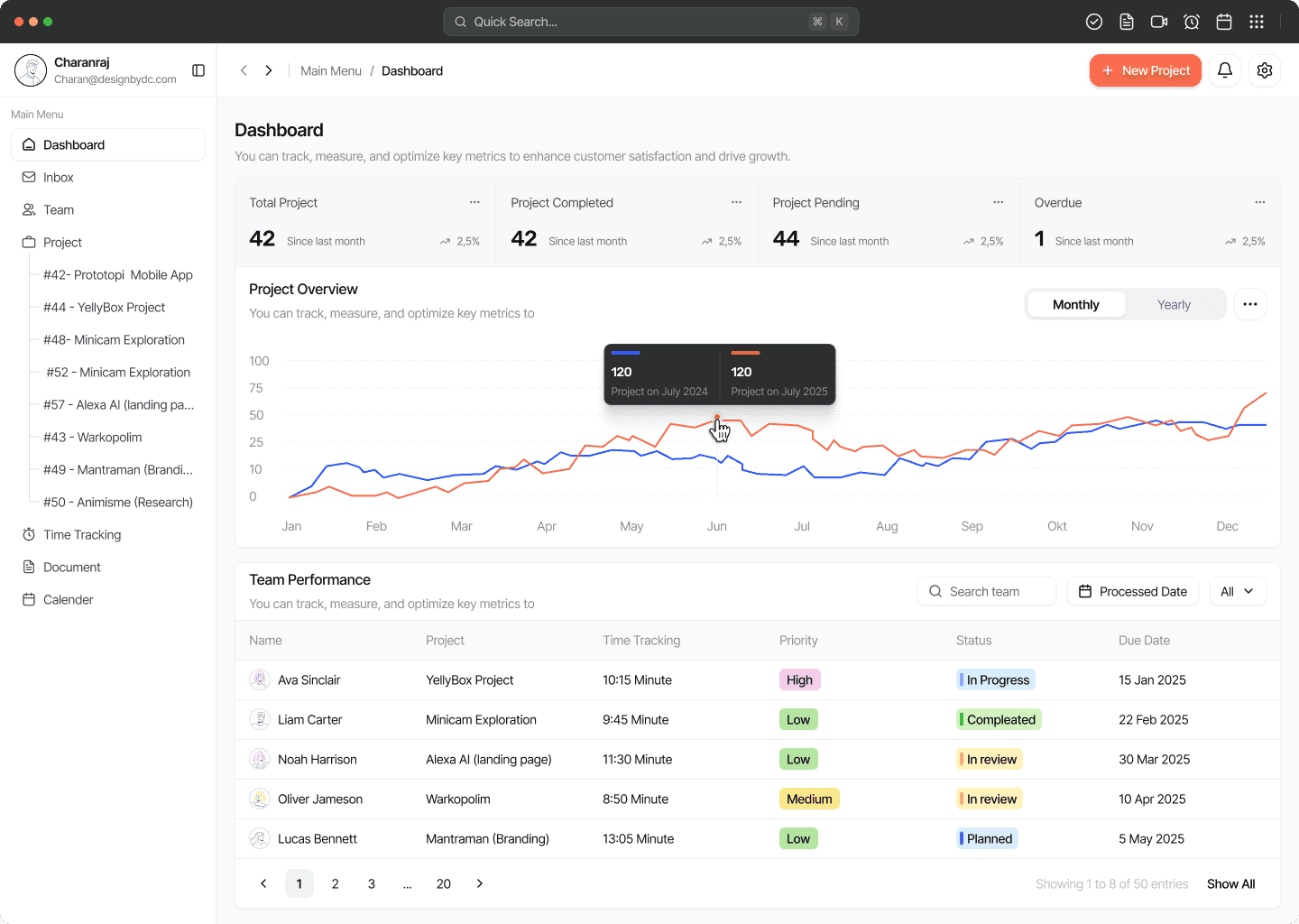
A single snapshot is meaningless without a baseline. Research showed executives making resource decisions based on current numbers without any context for whether those numbers were trending up or down. I added the 2024 vs 2025 dual-line chart with hover tooltips showing exact values. A number in context is a different kind of information than a number alone.
PUSHBACK 04 — ON STATUS TREATMENT
Accessibility was a requirement not a Phase 2 item.
"We can address colour-blindness support in a later release. Let's ship with colour-only status badges first."
I HELD THIS POSITION
3 in 8 research participants were colour-blind. Shipping colour-only badges means shipping a product that excludes 37% of the tested user base on day one. I built colour + text pairing into the token system before the first screen was high-fidelity. It cost nothing extra. Retrofitting it later would have cost significantly more.
THE DESIGN
Two screens. Two roles. Both decisions trace back to the same reframe.

SCREEN 01 - EXECUTIVE DASHBOARD
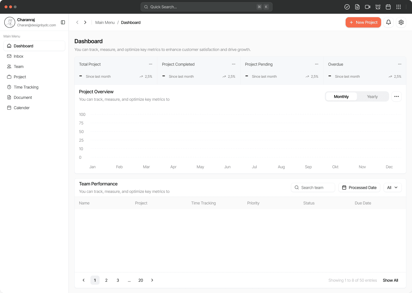
KPIs. One trend. One data freshness signal. Everything an executive needs in 30 seconds.
The dashboard surfaces what matters to each role first not everything at once. The overdue card uses orange (#F96C4D) deliberately to draw the executive eye to the single risk item. Every other card is neutral. The year-on-year dual-line chart gives trend context before the executive reads a single number.
THE DESIGN DECISION
The data freshness indicator "Last updated 2 minutes ago" is always visible, never conditional. This is the trust mechanism the brief didn't ask for and research proved was essential. Executives stopped calling PMs to verify data because the verification was built into the interface.
VIEW ALL 36 SCREENS AT DESIGNBYDC.IN →
SCREEN 02 — PM TASK VIEW
Blockers surface first. Triage tabs front and centre. Every task shows what it needs from the PM.
The PM view is not a feature list — it is a triage tool. Blocked tasks get a red left-border as a pre-attentive signal. The PM eye goes straight to what's on fire before reading anything else. The four sprint KPIs at the top replace the need to calculate sprint health manually.
THE DESIGN DECISION
The triage tabs — All (22) · At Risk (5) · Blocked (3) — came directly from research finding 03. PMs want to see blockers before they see everything else. I put that mental model into the navigation, not just into the data. This is what reduced blocker identification from 7 steps to 3.
VIEW ALL 36 SCREENS AT DESIGNBYDC.IN →
WHAT CHANGED
Executives stopped calling PMs. PMs stopped building reports manually. The system earned the trust the brief forgot to ask for.
Header 1 | Header 2 |
|---|
Report generation: 45 min → 8 min. | Automated, one-click. The PM assembles nothing. The system pulls from all sources simultaneously and produces a report the org can act on. |
Verification calls: 4/5 → 1/5 executives. | The data freshness indicator solved the trust problem that the brief hadn't named. Executives saw "Last updated 2 minutes ago" and acted without calling anyone. |
Blocker identification: 7 steps → 3 steps. | Red left-border coding and triage tabs removed the scan-and-search cycle. The PM eye goes to the critical item before reading a single word of text. |
Task completion rate: 62% → 91% in testing. | Tested with n=8 — 4 PMs, 4 executives. Scenarios covered report generation, blocker identification, and executive portfolio scan. All three scenarios improved substantially. |
SUS usability score: 58 (Poor) → 82 (Excellent). | A 24-point increase crossing from Poor into Excellent tier — and substantially above the 75 threshold defined as the project goal before design began. |
Metrics from usability testing with n=8 participants. Full methodology available privately on request.
"I came in thinking the problem was missing data. I left knowing the real problem was missing trust."
Quantify before you design. Qualitative feedback like "it feels easier" is not enough for an enterprise portfolio. Setting measurable baselines before testing gave every design decision a number to stand on.
The full depth is at designbydc.in.
Every research session. All 5 HMW questions. 6 user flows. Complete IA. 36 screens with decision captions. Reflections. Full methodology.
View full case study →
