Resource Monitor System
Enterprise platform focused on workforce planning, intelligent resource allocation, defect issue tracking, and operational visibility.
Enterprise SaaS
Operational Intelligence
ROLE
UX Designer - end-to-end
Scope
12 weeks - Desktop - Mobile
TEAM
2 Enginners, 1 PM, me
Domain
Semiconductor / Enterprise - Live


The brief asked for a better spreadsheet interface. The real problem was visibility.
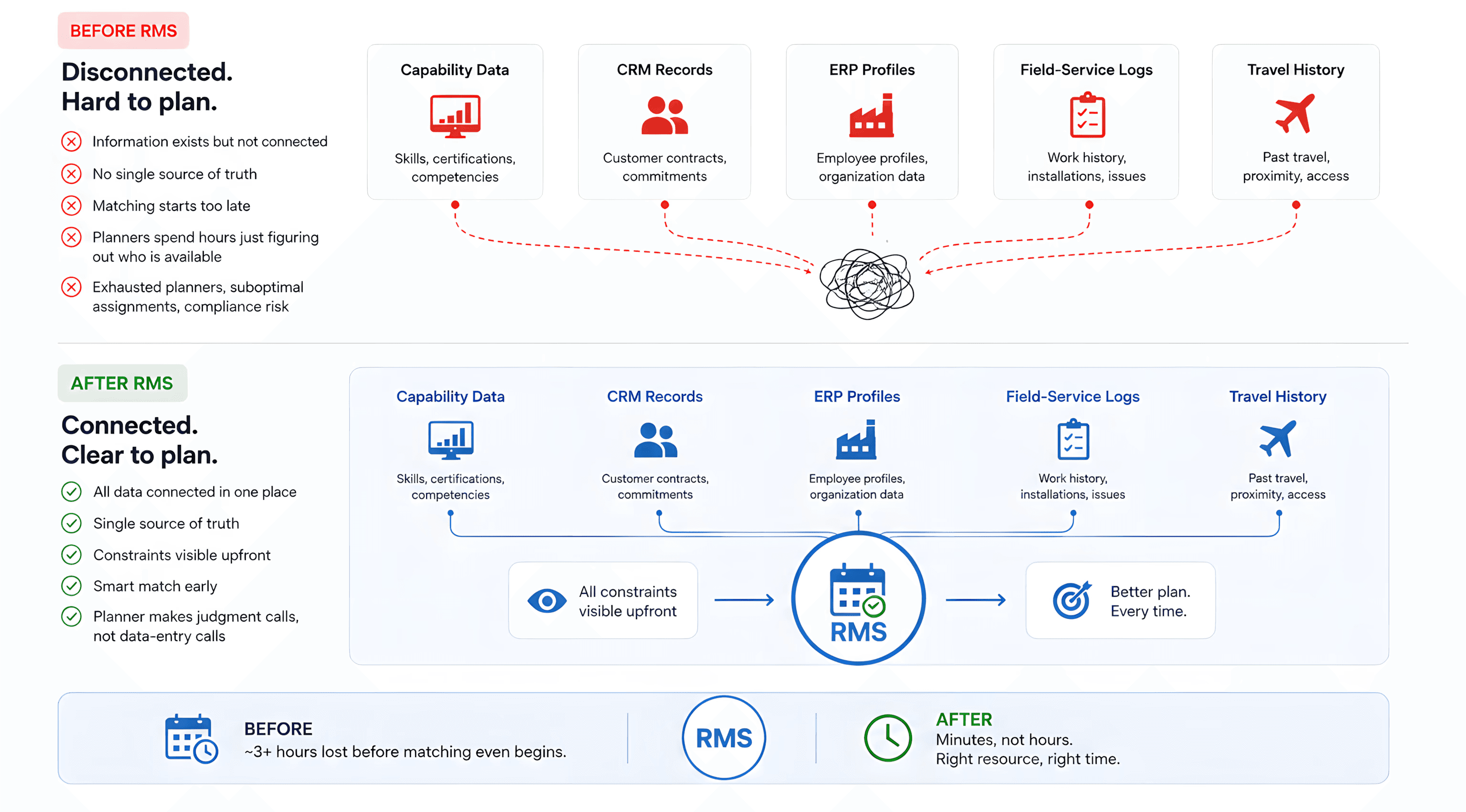
The org already had all the data. It lived in five disconnected systems. No planner had a single view of who was certified, available, and geographically sensible to assign. I reframed the design from interface improvement to visibility as the product.
Role | UX Designer |
|---|---|
Scope | User Research · Design Principles · Lottie Animations · High Fidelity |
Platfrom | Web · Tablet · Mobile |
Industry | Enterprise field-service operations |
Duration | June 2024 - Dec 2024 |
Cross Functional Team | PM, Engineering Leads, Data Analyst, Operations Planners, Director and VP |
THE PRODUCT
One system. Five constraints. Five data sources that used to live apart.
A large hardware manufacturer installs complex equipment for customers worldwide. Each install needs a certified engineer, in the right location, within a tight window without burning the travel budget or overloading the same people every cycle. That coordination used to live in spreadsheets, email threads, and individuals' heads.
BEFORE VS AFTER
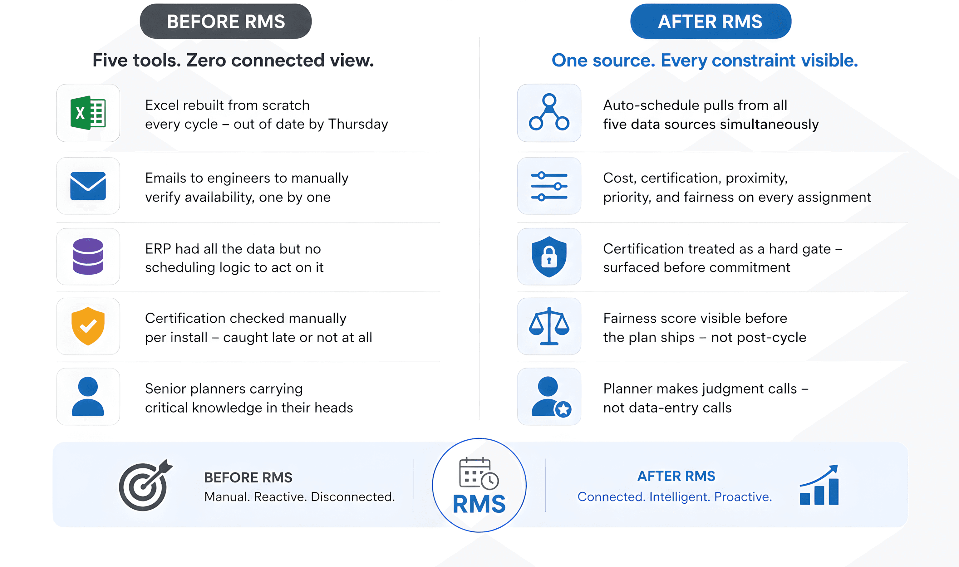
I LED THE UX DIRECTION ACROSS A CROSS-FUNCTIONAL FROM DAY ONE
One goal. One system. Every function aligned from the start.
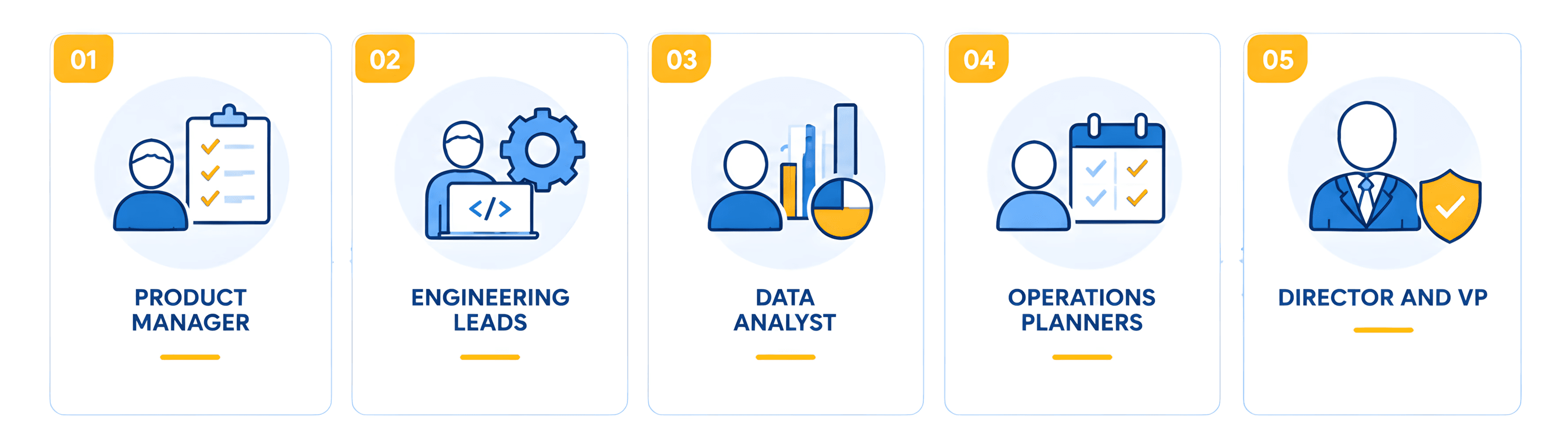
PRODUCT MANAGER
Aligned business requirements and sprint scope throughout
ENGINEERING LEADS
Implemented the scheduling engine and shipped from the design system
DATA ANALYST
Defined the data architecture across the five source systems
OPERATIONS PLANNERS
Validated workflow logic through two observed planning cycles
DIRECTOR AND VP
Final sign-off authority approved the brief reframe at first review
THE BRIEF
What the stakeholder asked for.
"Build a resource management system that lets operations planners assign field engineers to customer installations more efficiently. Replace the spreadsheet. Reduce manual effort. Improve scheduling speed."
Reasonable brief. Clear brief. A brief built on the wrong diagnosis.
THE REAL PROBLEM
The spreadsheet was not the problem. The disconnection was.
THE REFRAME
"The hard part was never the data. It was making a global, multi-constraint scheduling problem legible - so one planner could look once and know exactly what to do."
Research confirmed the org already had all the information it needed. Capability data, CRM records, ERP profiles, field-service logs, travel history all of it existed. None of it was connected. Planners were not struggling with a bad interface. They were spending the first three hours of every planning cycle just figuring out who was even available. By the time they got to matching, they were already exhausted.
I reframed the brief in week 2. The strategy shifted from interface improvement to visibility as the product. That reframe changed every decision that followed.
HOW I LED IT
End-to-end. Research through handoff.
Sole designer on the project - the research strategy, the sessions, the synthesis, and every design decision from first wireframe through engineering handoff. No delegation on the hard calls.
8 stakeholder interviews personally - planners, field engineers, and regional managers. The research was structured around one question the brief had not asked: what is actually broken here, and why does nothing already fix it.
Observed 2 live planning cycles end-to-end - noted every tool opened, every email sent, every spreadsheet checked. That shadowing is where the real problem revealed itself.
Presented to Director and VP level - sign-off without major revisions at the first review. The reframe from interface to visibility was accepted because it was grounded in what research actually showed.
Built the design system in parallel with the first screens - tokens, components, and patterns established before any hi-fi work began. Engineering shipped from the design system. Consistency was guaranteed from day one.
Produced the motion companion alongside the UX - not after. The animation work and the product design informed each other throughout the process. If something was hard to animate, it was a signal it was hard to understand. That feedback loop tightened both the motion and the interface in ways a sequential process would not have caught.

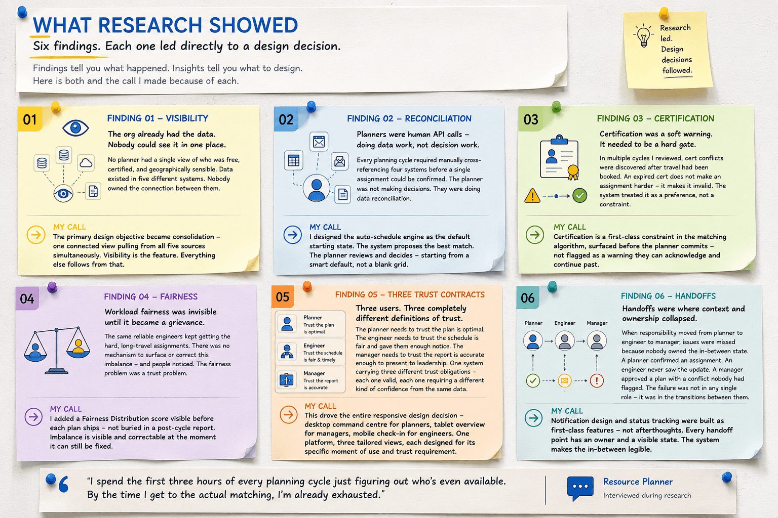
WHAT RESEARCH SHOWED
Six findings. Each one led directly to a design decision.
Findings tell you what happened. Insights tell you what to design. Here is both and the call I made because of each.
FINDING 01 - VISIBILITY
The org already had the data. Nobody could see it in one place.
No planner had a single view of who was free, certified, and geographically sensible. Data existed in five different systems. Nobody owned the connection between them.
MY CALL
The primary design objective became consolidation one connected view pulling from all five sources simultaneously. Visibility is the feature. Everything else follows from that.
FINDING 02 - RECONCILIATION
Planners were human API calls - doing data work, not decision work.
Every planning cycle required manually cross-referencing four systems before a single assignment could be confirmed. The planner was not making decisions. The were doing data reconciliation.
MY CALL
The auto-schedule engine became the default starting state not an optional feature. The system proposes the best match. The planner reviews and decides starting from a smart proposal, not a blank grid.
FINDING 03 - CERTIFICATION
Certification was a soft warning. It needed to be a hard gate.
In multiple cycles I reviewed, cert conflicts were discovered after travel had been booked. An expired cert does not make an assignment harder it makes it invalid. The system treated it as a preference, not a constraint.
MY CALL
Certification is a first-class constraint in the matching algorithm, surfaced before the planner commits - not flagged as a warning they can acknowledge and continue past.
FINDING 04 - FAIRNESS
Workload fairness was invisible until it became a grievance.
The same reliable engineers kept getting the hard, long-travel assignments. There was no mechanism to surface or correct this imbalance and people noticed. The fairness problem was a trust problem.
MY CALL
A Fairness Distribution score was added as a pre-publish decision gate not buried in a post-cycle report. Imbalance becomes visible and correctable at the moment it can still be fixed.
FINDING 05 - THREE TRUST CONTRACTS
Three users. Three completely different definitions of trust.
The planner needs to trust the plan is optimal. The engineer needs to trust the schedule is fair and gave them enough notice. The manager needs to trust the report is accurate enough to present to leadership. One system carrying three different trust obligations each one valid, each one requiring a different kind of confidence from the same data.
MY CALL
This drove the entire responsive design decision desktop command centre for planners, tablet overview for managers, mobile check-in for engineers. One platform, three tailored views, each designed for its specific moment of use and trust requirement.
FINDING 06 - HANDOFFS
Handoffs were where context and ownership collapsed.
When responsibility moved from planner to engineer to manager, issues were missed because nobody owned the in-between state. A planner confirmed an assignment. An engineer never saw the update. A manager approved a plan with a conflict nobody had flagged. The failure was not in any single role - it was in the transitions between them.
MY CALL
Notification design and status tracking were built as first-class features not afterthoughts. Every handoff point has an owner and a visible state. The system makes the in-between legible.
"I spend the first three hours of every planning cycle just figuring out who's even available. By the time I get to the actual matching, I'm already exhausted."
Resource Planner - interviewed during research
WHERE I PUSHED BACK
Four positions I held - or took without being asked.
PUSHBACK 01 - VS ENGINEERING
The constraint reasoning had to stay visible.
"The constraint panel is too complex to build within the sprint. Just show the assignment result. Planners can trust the system."
I HELD THIS POSITION
Removing the reasoning does not make the system simpler it makes it untrustworthy. The moment planners could not see why a match was recommended, they rejected it and rebuilt the plan themselves. The constraint panel is not a feature. It is the trust mechanism.
PUSHBACK 02 - ON CERTIFICATION HANDLING
A cert conflict had to block - not warn and continue.
The initial spec treated expired certs as a soft warning a flag the planner could acknowledge and proceed past if they chose.
I REFRAMED THE DESIGN
An expired certification does not make an install difficult. It makes it legally invalid. Soft warnings are for preferences. Hard constraints are for blockers. I redesigned the cert check as a gate in the matching algorithm - not a notification after the fact.
PROACTIVE DECISION 03 - NOT IN THE BRIEF
I added the fairness score without being asked.
The stakeholder brief had no mention of workload fairness. It was not a requested feature. It was not a success metric.
I ADDED IT ANYWAY
Research showed the problem existed and was eroding trust across the engineering team. The same people kept getting the hardest assignments. A product that ignores a problem it can see is not a well-designed product. I added the Fairness Distribution panel as a first-class feature and made the case to the stakeholder with the research data.
PUSHBACK 04 - ON PLATFORM SCOPE
Desktop only was not enough. I pushed for three breakpoints.
The brief scoped the product as a desktop tool. One platform, one user, one context.
I PUSHED FOR THREE
Research showed that managers review plans in meetings on tablets and engineers check assignments in the field on mobile. Designing only for the desktop planner meant building a system that two of the three users would work around. I made the case for three tailored breakpoints each designed for its specific user, context, and trust requirement.
THE DESIGN
Two screens. Two decisions. Both trace back to the same reframe.

SCREEN 01 - DASHBOARD - DESKTOP 1440PX
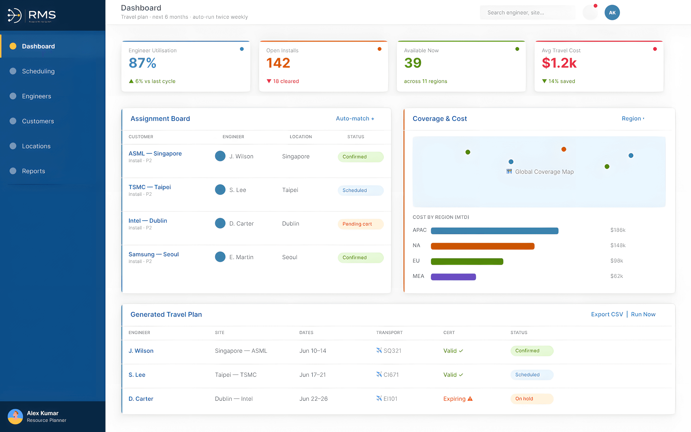
Five sources. One view. Every constraint visible before any decision is made.
The dashboard does not show features it shows the information that used to live in five separate tools. Utilisation, open installs, availability, the fairness score, and cost coverage are all surfaced from the same connected engine in real time.
THE DESIGN DECISION
Visibility is the product. I designed the KPI row to reflect all five constraints simultaneously including the fairness score, which had never been visible to planners before. Showing what was previously invisible is the core value of the system.
A restrained enterprise design language confident typography, semantic colour, and a component library built to scale across new workflows without re-designing from scratch.
SCREEN 02 - SCHEDULING - DESKTOP 1440PX
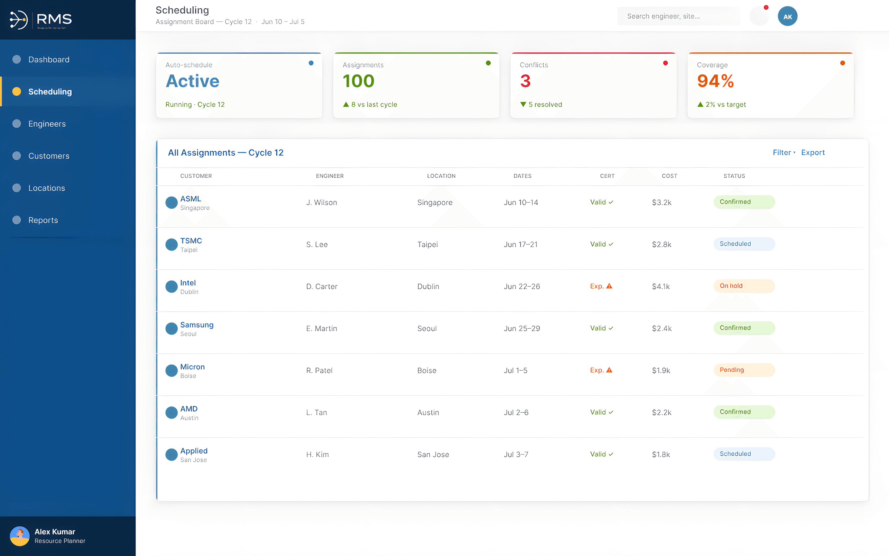
System proposes. Reasoning visible. Override at every row.
The assignment board shows the auto-generated plan with cost, certification, and fit signals visible on every row not just the result. Every row has an override control. The planner starts from a smart default and makes judgment calls not data-entry calls.
THE DESIGN DECISION
Showing the reasoning alongside the recommendation is what makes the system trustworthy. A planner who can see why a match was made does not need to rebuild the plan to verify it. That is the difference between a tool that gets used and one that gets worked around
WHAT CHANGED
The org did not get a better spreadsheet. It got a connected system it could trust.
Right engineer. Right place. On time.
Customer coverage improved because every install was matched on all five constraints simultaneously - not just whoever the planner remembered was available.
Travel cost reduced through regional matching.
The system surfaces domestic and regional matches first. Long-haul travel became the exception, not the default - because the tool made alternatives visible for the first time.
Planners making decisions - not doing data work.
The auto-generated plan removed the 3-hour reconciliation cycle. Planners started from a reviewed proposal and made judgment calls - the work they were hired to do.
Fairness visible and correctable before it ships.
Workload imbalance became a planning decision, not a post-cycle grievance. Engineers could see how work was distributed. Managers could correct it before the plan went live.
The design system became the foundation for future modules.
Built once, in parallel with the first screens, it reduced the design and engineering effort for every new workflow that followed. Consistency was structural not enforced manually each time.
The motion companion changed how the system was understood before it was used.
Produced alongside the UX rather than after it, the motion work became a communication tool for the system's logic - not just a demonstration of its screens. Engineers and managers who saw the animation understood what RMS did before they ever logged in. Designing motion and product in parallel meant both were shaped by the same thinking at the same time.
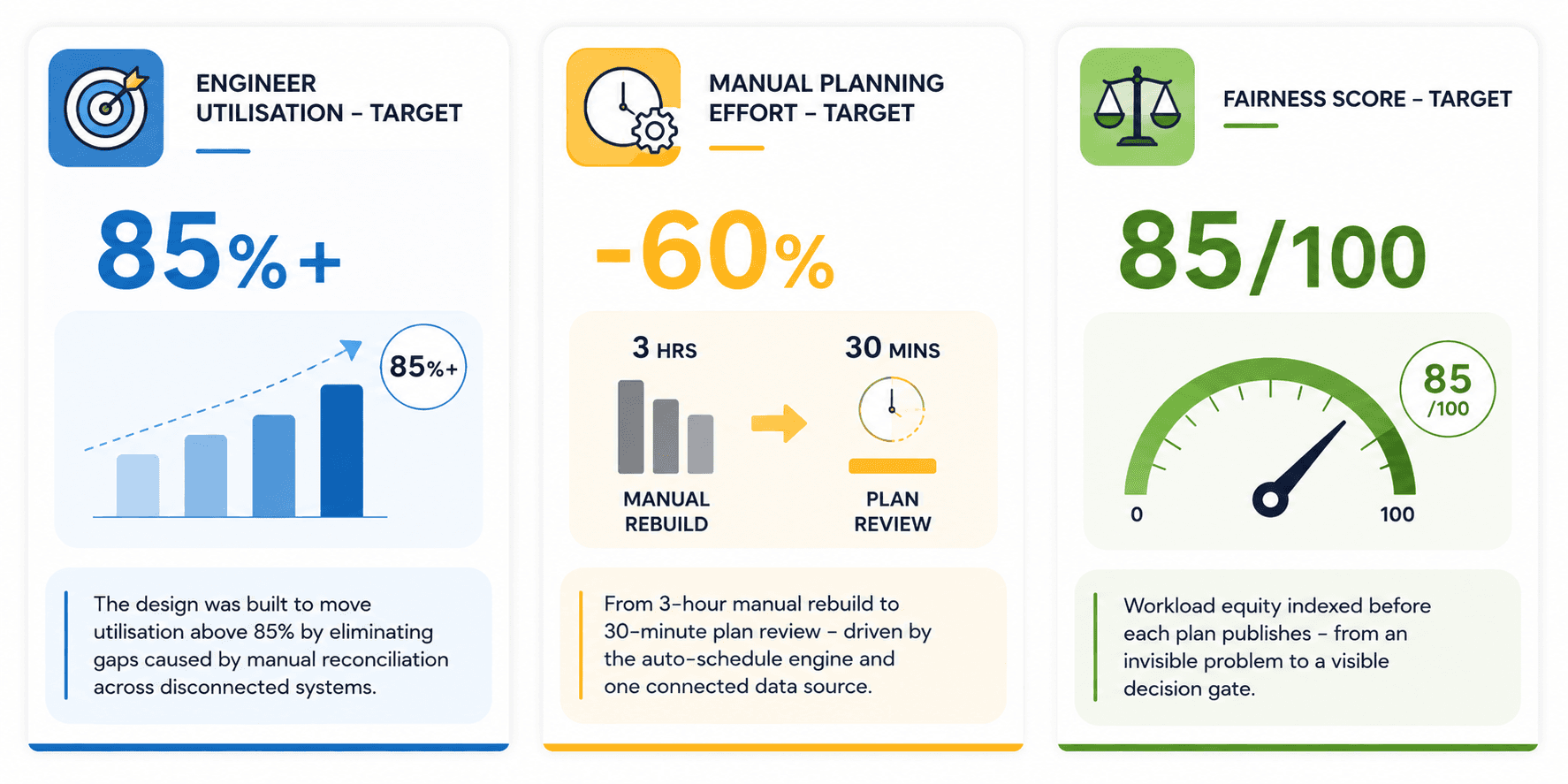
"In enterprise UX, visibility is the feature. The org already had the data the win was arranging it so one person could hold a five-constraint decision in their head and feel confident."
Designing for complexity does not mean simplifying the domain. It means making the complexity manageable. Those are very different things.
FULL CASE STUDY
The full depth is at designbydc.in.
Every research session. All 6 user flows. The complete IA. All 25 screens with design decision captions.
View full case study →
